The streets of San Francisco have always been hilly, foggy and ideal for movie car chases — now they’re a battleground for alternative forms of transportation.
Scooters. Electric bikes. Hoverboards. Just who gets to use the bike lane? Park on the sidewalk? Take up streets for docking stations? Going by recent headlines, it’s a skirmish, conflict and a battle.
Mapbox recently hosted a crack panel on micro-mobility. In addition to stuffing myself with dumplings and potstickers (so, so grateful not to stare down the standard soggy meetup takeout pizza!) here are a couple of quick takeaways: Continue reading →
This isn’t the first time Frank Welte finds himself in front of an audience that doesn’t know how to read a map. He stands up and presses the thick 11” X 11.5 paper map across his torso on a diagonal. The right hand holds one corner steady; with the left he navigates a slice of San Francisco’s South of Market neighborhood.
“The first thing I’ll do,” he tells the assembled graphic designers, user experience experts and urban planners during a two-hour workshop, “is start at the upper left, to see what the title of the map is, find the scale and locate north.” This three-page black and white map shows the area around Market Street where Welte, who is blind, works as an accessibility media specialist at LightHouse for the Blind and Visually Impaired. Without adding a crinkle to his blue dress shirt, he speeds to the center of the map for the “you are here” cluster of dots in a circle, finds Market street and starts tracing parallel streets, using the key on the pages behind it to locate street names.
Mappers in Semarang. Via Humanitarian OpenStreetMap Team Indonesia.
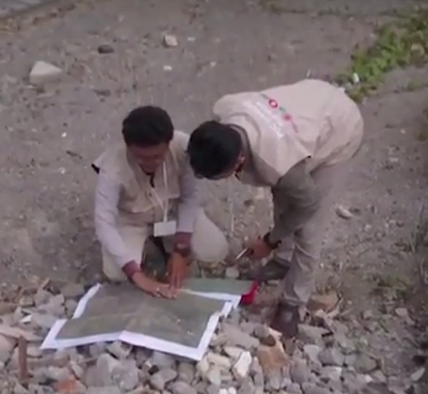
Landslides. Motorcycle accidents. Mistaken for terrorists. These are some of the challenges faced by a team of local mappers in Indonesia working on disaster preparedness projects in three cities.
These speed bumps only make Harry Mahardhika chuckle. A training officer at Humanitarian OpenStreetMap Team Indonesia, he still managed to hand over atlases to government officials in Jakarta, Surabaya and Semarang. The printed maps show what he calls “lifeline infrastructure” — shelters, reservoirs, banks, hospitals, fire stations and the like. His team also provides workshops to officials on best practices for verifying map data plus training manuals and documentation on mapmaking. Continue reading →
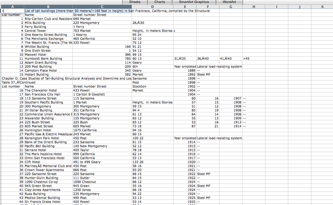
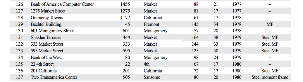
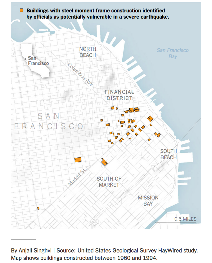
It looks like the New York Times may have undercounted the number of risky skyscrapers in downtown San Francisco, 48 instead of 39. It’s a seemingly small difference – 20 percent if you do the math – but it’s significant if you consider how many people work in these large buildings. A June 15 story focused on steel moment buildings cited in a USGS report.
I made a quick map using the addresses from the NYT story, then I wanted to make one that included photos of the buildings. This time I went directly to the report, noticing that the first address wasn’t listed in the story, it seemed like a good idea to see if there were any more discrepancies.
The .KML file I made, for more fact-checking and map making (pretty please send links to your maps or put them in the comments – I’m a casual mapper, using new tools and working quickly!)
Here are the additional nine addresses from the report that weren’t in the NYT story:
The Mills Building, 221 Montgomery Street
225 Bush Street
140 Montgomery Street
120 Montgomery Street
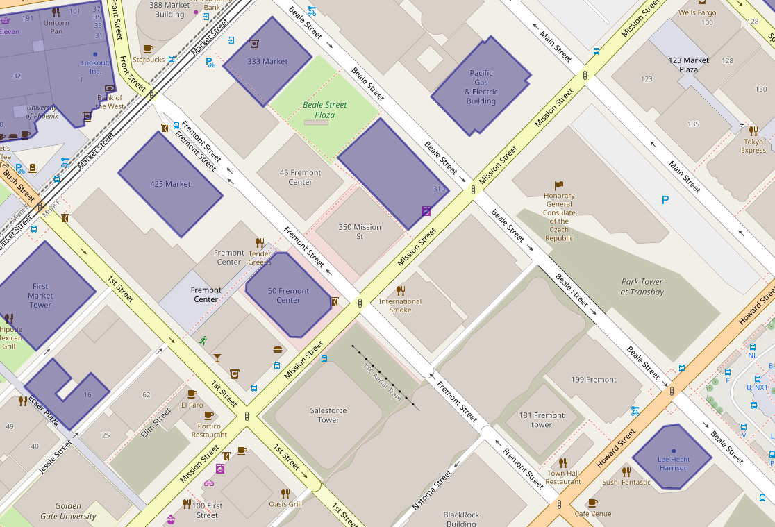
45 Fremont Street
55 2nd Street
555 Mission Street
611 Folsom Street
680 Folsom Street
The clumsy adventure
To start, I downloaded the 454-page .PDF, then extracted five pages with the buildings listed by using the >Print>Pages>Save as .PDF function in Preview for Mac. Then I converted the .PDF to .CSV with Sejda. After that, it was time for Terminal to merge the extracted data from those pages into one file with the command:
cat *.csv >merged.csv
Still too messy to be useful without a lot of tedious cleanup:
So I tried the quickest and dirtiest way I know: copy the table from the .PDF into Word, then from Word (where it’s recognized as a table) copy it into Excel.
There are a couple hundred buildings listed, but the ones cited in the story are steel moment frames. Erected before a 1994 building code outlawed a flawed welding technique, they harbor particular risk in a quake of magnitude seven or higher.
From the USGS report: Steel moment frame listed as “Steel MF,” “Steel moment frame” and “MF.”
From there it was a question of sorting the buildings listed as “Steel MF,” noting that a couple are listed alternatively as “Steel moment frame” and one as simply as “MF.” Messy messy messy: also, totally typical. (There were also about 15 more listed as Steel MF in combination with some other reinforcement, since it would require more reporting to figure out if they’re as risky, these were left out.)
Then I checked the addresses against the story, added polygons for the nine new addresses to the previous uMap, downloaded it as a .KML file and started playing around in Google Maps.
The resulting map is a little disappointing. For starters, the polygons from uMap (which uses OpenStreetMap) don’t jibe that well with Google. As for the images – since the real a-ha if you live or work in San Francisco is how many of these buildings you’re in or around – I always forget how bad these are in the noob version of Google Maps. When you’re editing in the map, they are Polaroid-style pop-ups that resize whatever pic you throw in. The published version looks nothing like that and the overall effect with these building shots (all vertical) is horrific. Ugh. There’s no way to resize the window from this version of Google Maps – the alternatives are Google Fusion tables (which wouldn’t solve the problem here since AFAIK it works with points, not polygons) or programming via the Google Maps API.
Why this happened
So how did the New York Times undercount the number of especially shaky high rises? Going on my experience with newsrooms (long) and with data (short but painful) my first guess is that the USGS mistakenly gave the Times an Excel or .CSV file that was different from what ended up in the final report.
The reporter knew there were enough buildings to warrant a story, somewhere around 40, the graphics person had the file, made the map and those numbers were plugged into the story and fact checked without going back to the published report.
Or there was some glitch between the formats – given how annoying the process of getting information from .PDF into anything – it’s easy enough. Data cleaning is the least interesting, most tedious part of any project. In this case, if I’m right, there are 20 percent more risky buildings than originally reported.
See full screen – search for San Francisco if you see a world map.
The New York Times recently ran a story about San Francisco high rises – mostly downtown and South of Market – with steel frames that harbor particular risk in a quake of magnitude seven or higher. About 40 of these skyscrapers, erected before a 1994 building code outlawed a flawed welding technique, were cited in an April USGS report.
It’s one of those stories that could’ve used in interactive map at its core, but instead (it’s the news business, kid!) the map was a small, static graphic (see below) and the story ended with a list of the addresses.
Image courtesy NYT.
So here’s a simple map of those 39 steel moment-frame buildings. A few necessary caveats: this is the handiwork of a casual mapper trying out a new tool. I’ve been looking for a way to use OpenStreetMap to make personalized maps and spotted some earthquake maps from the Japanese OSM community with uMap, so it seemed worth a try. It was heavy going for a map made on the fly – the polygon tool was clunky and importing the list as a cleaned up .CSV wasn’t happening.
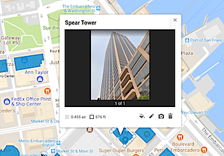
Still, a few things pop out: A few of these risky buildings are also near construction sites. In OSM, these are shown in sage green. (The light green represents parks.)
The struggle to use the uMap polygon tool is real. This is a closeup of 550 California Street, with a 19-story office building under construction nearby.
The Folsom Bay Tower will be a 39-story, 422-foot (129 m) residential skyscraper.
Park Tower at Transbay will have 43 stories, First & Mission’s Oceanwide Center features 636-foot-tall tower on Mission at First Street and a 910-foot-tall tower on the opposite corner on First Street.
And much like the reporter, shocked to discover the NYT offices are in one of these buildings, there were a few a-ha moments. A family member works in one and I’ve been inside at least a handful recently – an event at Autodesk, a movie at Embarcadero Center, a meetup, drinks with a friend staying at the Marriott, emerged from the Montgomery Street Station in front of one three or four times, etc.
It’s an unscientific sample size of one (well, two if you count the reporter) but would wager that most people who live or work in San Francisco are around, if not inside, these buildings frequently.
This post has been developed into a talk about getting PR for your startup, if you’d like to know more, get in touch!
SAN FRANCISCO — You created an app. You think it’s awesome. Your friends say so too. Something nags at you, though: You have zero reviews, your downloads don’t outnumber your Facebook pals, and you need to make rent.
There’s a fancy name for your problem: “discoverability.” Millions of good apps face it, gathering dust between bogus fart apps and Flappy Bird clones.
“It’s hard to make a living in the App Store,” says Michael Yacavone, founder of Individuate, which makes personal-development apps Ace It! and Affirmable.
But there is definitely money to be made in the App Store, to the tune of $15 billion Apple has paid developers so far. Apple recently vowed to improve discoverability by adding an “explore” tab to the App Store, but whether users will search for new and exciting apps remains to be seen. The basic problem remains for most developers: Nearly everyone is ignoring you. Journalists can help, but you have to know how to deal with them.
At AltConf last week, developers like Yacavone got a chance to chat with tech journalists (including me) about how to garner the kind of coverage that can make or break an app. Billed as a Journalist Pitch Lab, the session felt a bit like speed dating. Some devs hit us with the equivalent of, “Hey what’s your sign?”; others just wanted to talk.
“It’s always great to get face time with journalists,” said Tara Zirker, director of social media and engagement for Imagine If, who was at the AltConf event to talk about her company’s travel app, StayAtHand.
Problematic pitching
While chatting with developers for three hours straight during the AltConf session, I noticed several problems that bubbled to the surface repeatedly.
You don’t know what your app is
You need to know how to get your product across in a sentence or two. Sometimes, people jumped straight into a demo, forcing me to half-listen, half-interpret: “So, this is a Skype/Instagram/eBay killer for the business market?” You don’t want the press wondering what it is you do, especially while you’re rocketing ahead to show off the extra-cool features. This happens all the time in email pitches.
Also, do it simply. You’re a regular person, not a carnival barker. We’re regular people too. Aim for colloquial English, the kind that lives far, far away from PowerPoint presentations. Jargon sucks.
You don’t know who it’s for, or what it’s for
Who would use this app? Why would they want it? This isn’t always as obvious as it seems. And, if you’re touting features like social sharing, be able to answer why your users would want to do that — just because you can include a feature doesn’t mean you should. Or that someone would want to use it. Most journalists avoid buzz-features du jour with the same vehemence that they would steer clear of a “mocktail” hour.
You don’t know what goes into (or should be left out of) a press release
If you’re reaching out on your own to journalists, keep it simple. Don’t link to a “press kit” or point them to a video if your concept can be explained simply. Avoid terms like “exclusive” and “embargo” (it’s gone the way of the CB radio) — they will only increase your chances of getting ignored or into trouble. Make sure you cover the 5 Ws (who, what, when, where, why and how) and include your preferred contact info for quick follow-up. Then forget that it’s a “press release” at all and write like a normal person. Proofread it. Hit send. Repeat, repeat, repeat.
You don’t know that you’re part of the story
If your personal life/background is relevant to your company story, use it to hook interest. Are you a former Apple employee? That’s worth mentioning sooner rather than later. Did you spend 20 years in the food industry before teaching yourself to code a cooking app? Bring that to the table when you’re pimping your story.
It can be a simple sentence or two in a short email — depending on whether your focus is getting product coverage (new release, you just won an award) or a less timely, profile-type piece. But if you are the story, know that going in.
Tara Zirker shows the StayAtHand travel app to MacRumors’ Arnold Kim during AltConf’s Journalist Pitch Lab. Photo: Jim Merithew
You think of yourself as a product, not a source
No app is an island. You may want blanket coverage when you’ve got news, but that’s a numbers game where the odds are against you. You could send out hundreds of emails and get zero coverage in return. A week later, you’re not news anymore, and no one knows you’re out there.
Know the hot-button issues and the seasonality of your industry. Think about your App Store category — fitness? health? dating? It’s easy to pitch marriages sparked by dating apps in early February but an uphill climb to pitch any news about a ski app in the summer.
Consider yourself a source. If you’re an award-winning, cross-platform indie developer with something to say about Swift, we want to hear it when news breaks. Or maybe you’re a designer having to tweak iOS 8 for your clients because of legibility issues that you haven’t read about anywhere yet.
Go to the publications that you regularly read, search for the topic (or your competitors) and fire off a short email to the reporter. Tell them you know they cover the topic, what your point is, why you think your point is interesting/new/different and end with the best way to contact you for a follow-up. Proofread your email and consider anything you write a quote – in other words, it could end up published.
Monitor coverage of your competitors. (Google alerts are perfect for this.) Mainstream media is a great place to look for big ideas: Did USA Today just run a piece on the next generation of travel apps? That story will be passed around in more ways than a nimble young lass at a square dance competition. Find a way to be a part of it.
If you have a company or personal blog, write about that article and put your own spin on it. The same day, if possible. And get it out using the names of your biggest competitors in the social media blast. It might get picked up in the blogosphere – that endless hall of mirrors reflecting publications of varying size and slant.
Also, write that USA Today reporter a short note, telling them either what you liked or what they got wrong (gently, this last one), how you fit into the picture, and what makes you stand out from the pack. Ask that they consider you a source for future stories and provide the best way to contact you. Freelancers may be able to get you into a different publication as they re-spin the story. Also, journos switch jobs frequently. And they also help each other out by trading smart sources who respond quickly.
If you develop relationships with reporters at other publications, write them about it, too, finding a way to push the story forward. An incisive sentence or two about what the implications are or what may happen next given the upcoming legislative hearing and bam! You’re quoted in a post and become part of the echo chamber.
You don’t know if you need a PR firm or not
Should you interface with the press yourself – or do you need a public-relations person to help you out? Consider this: If you are easily hurt, clueless about all of the above, have no time and are super-nervous about the way you speak or write, get a publicist. They can help you determine where you fit into the news and make you look good until you get the hang of it. Ask them how they will position you and what they think your story is — it will help you to get an outside opinion. Caveat: They cannot (and should not) guarantee that you will get massive coverage. However, they may cut down on the wear and tear to you in the process.
Otherwise, it may be better to go solo. According to the United States Bureau of Labor Statistics, public relations professionals outnumber reporters about four to one. Journalists are being slowly suffocated under the weight of press releases, many of them not better (and certainly not more personal) than you could write yourself. I can count the number of interesting, relevant emails from actual people sent to me, personally, without taxing my brain as much as calculating a restaurant tip does. And I’ve ended up writing about almost all of them.
You don’t know the answers to six difficult questions
Any reporter worth that title will ask you something you’d rather not answer, sooner or later. Think ahead about what you’re going to say. Keep it simple. Jargon sucks and, in the face of a tough question, it’s easier to see through than Kim Kardashian’s blouse.
Some standard toughies:
“Why should my readers care?” “Who are your competitors and why are you different/better?” “Where’s the money coming from?” “What’s your business model? “Is this really anything new, after XYZ already did it?” “What about privacy/legal issues/data, etc.?”
That’s basically it. If you have more questions about how to deal with the press, ask me in the comments or email me directly.
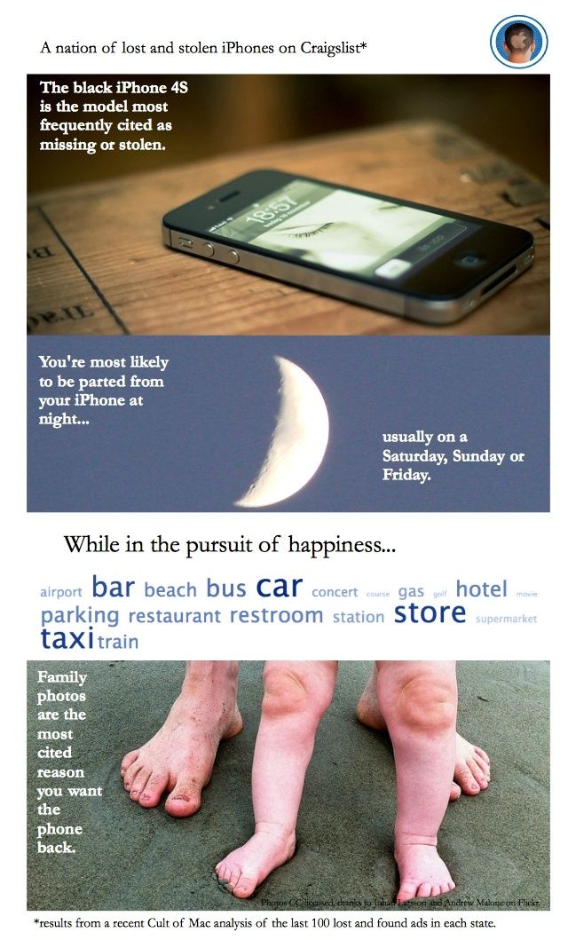
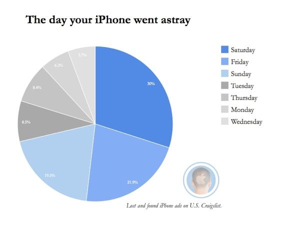
I am not a psychic, but I have a good idea where you and your iPhone parted ways.
If you’re desperately seeking it on Craigslist, chances are you lost your device – or had it stolen – over the weekend, especially at night. And probably at some fun destination – shopping, the beach, a bar – or heading there on your usual means of transportation (the car, a gas station or parking lot, or bus).
Although your entire work life might be on it, you are pleading with the person who found it (or swiped it) to return your iPhone because those photos of your dog or kid or grandma can never be replaced.
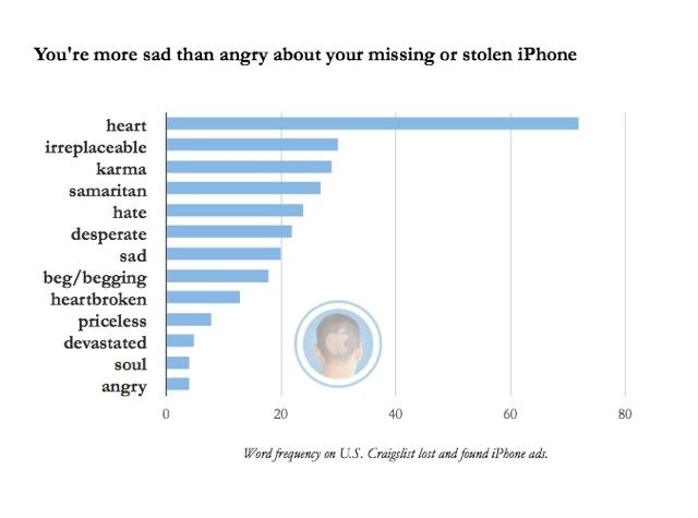
This is the most common tale to emerge from Cult of Mac’s recent analysis of hundreds of iPhone lost and found ads on Craigslist blanketing the entire United States. (Here’s the backstory on how I did it using Python, if you’re interested.)
Stealing iPhones (“Apple picking”) now accounts for about half the crimes in cities like San Francisco and New York; it’s hard to say how many absent-minded drinkers leave them at bars, but if you find a phone and don’t return it, in many places that becomes theft by finding.
Police and Apple diverge on what to do about it. The Cupertino company advises you to notify police, while some authorities are urging phone makers and service providers to add a kill switch to curb thefts.
Apple’s “Find my iPhone” can help, unless the savvy crook pops out the SIM card or wipes the contents of your phone and starts over. This gray area has inspired some derring-do recoveries, like outing the thief or the finder-who-wants-to-be-keeper by staging a diabolical seduction. Not recommended.
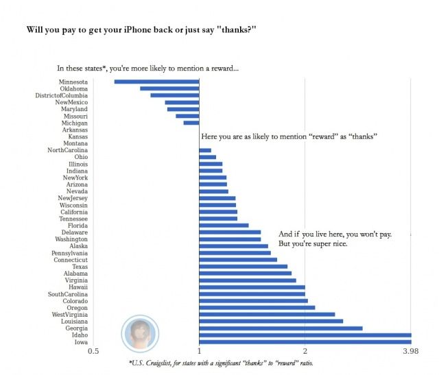
In the meantime, if you’re hoping someone will return your lost iPhone or realize they’ve bought stolen goods and do the right thing, you’re probably heading to Craigslist.
Generally speaking, you’re more likely to offer heartfelt thanks than a reward for the return of your phone. Unless you live in a place such as Washington, D.C. or Michigan, then you’re ready to bust out the cash.
After combing through these ads for the project, I bought an ugly white case for my black iPhone 4S to make it easier to see in the pitch of all of my dark bags and on taxi seats, etc. As a result, I am having fewer of those “where’s my goddamn phone?” moments.
Have you lost your iPhone? How did you recover it? Let me know in the comments.
Those rich reds adorning paintings in Pompeii were originally ochre — Italian researchers say they now think that sensuous Pompeian red is the result of an accident.
Researchers at the national science council (CNR) say the original signature color at the ill-fated city of Pompeii was probably yellow – ochre to be specific.
Before Mount Vesuvius blew its top in 79 A.D. and buried the city, it emitted high-temperature gas which turned the original yellow color that dark red. It’s not an entirely new discovery – ochre was also the main color at Herculaneum, sister city also buried by Vesuvius.
“Thanks to the investigations we have ascertained that the symbolic color of the archaeological sites in Campania is the result of the action of high temperature gas leakage which preceded the eruption of Vesuvius in 79 A.D.,” says Sergio Omarini of CNR.
“Experts already knew about the color alteration, but this research makes it finally possible to quantify to the extent of it.”
Researchers went back to texts by Pliny and Vitruvius to see how their contemporaries made red – cinnabar, mercury compound, red lead, lead compound and the rarest and most expensive pigments, mainly used in the paintings.
To check out the composition in the paintings, scientists used a non-invasive X-ray fluorescence (XRF) spectrometer that reveals the presence of chemical elements that exclude red lead and cinnabar – leading them to believe ochre was the original color.
Somehow Pompeian ochre just doesn’t lend the same tone.
This is just about as cheap a thrill as they get: by pledging even just a dollar, you can help fund a project to find a lost Leonardo Da Vinci fresco in Florence, Italy.
Photographer Dave Yoder has been working on for a number of years on a quest funded by the National Geographic Society to uncover The Battle of Anghiari in Palazzo Vecchio.
Because of the complications of doing just about anything in Italy – this involves going between ancient palazzo walls after all — it requires expensive expertise.
He’s put up a Kickstarter page to fund the sci-fi movie-worthy gamma camera needed to locate the painting which probably lies between the walls. (It seems Vasari couldn’t bring himself to cover Leonardo’s masterpiece when commissioned to paint over it in 1563).
Dave is a friend and it’s a fascinating project – one I also enjoyed reporting on — so I hope you’ll consider kicking in what you might spend on a cappuccino. Higher pledges $35 and up will earn you a digital e-book or prints of the project.
You can check out his pics on the project so far here.
To donate or for more information, see Kickstarter
As someone who has a hard time remembering what it was like to listen to music before you could hit “shuffle” or curate a digital playlist, I’m a big fan of automated music recommendation and Internet radio service Pandora.
But that streaming service offers almost no Italian music, whether you want classic folk, pop power ballads or moody dubs in dialect.
Enter Soundtracker, launched in 2010 by two Italian entrepreneurs. Best part: it offers a lot more than just Italian music and the interface is in English.
Register for the site (it’s free) and start listening to artists you know before stone-stepping to those you don’t.
Start with Pino Daniele and you’ll soon be listening to Quintorigo, Almamegretta, 99 Posse and Bandabardo’.
Not sure how the algorithm works, but it seems a little more freewheeling than Pandora — starting with 70s melodic rocker with a social conscience Fabrizio De’ Andre station got me to an aggro hip-hop number from Caparezza in under four tracks.
You can also download it as an app for your iPhone, Windows Phone 7 and, if you’re so inclined, share your location and tracks with your friends.
 Mapbox recently hosted a crack panel on micro-mobility. In addition to stuffing myself with dumplings and potstickers (so, so grateful not to stare down the standard soggy meetup takeout pizza!) here are a couple of quick takeaways: Continue reading