Navigating the San Francisco micro-mobilty wars

The streets of San Francisco have always been hilly, foggy and ideal for movie car chases — now they’re a battleground for alternative forms of transportation.

Scooters. Electric bikes. Hoverboards. Just who gets to use the bike lane? Park on the sidewalk? Take up streets for docking stations? Going by recent headlines, it’s a skirmish, conflict and a battle.

Mapbox recently hosted a crack panel on micro-mobility. In addition to stuffing myself with dumplings and potstickers (so, so grateful not to stare down the standard soggy meetup takeout pizza!) here are a couple of quick takeaways: Continue reading

Maps at your fingertips: The challenges and future of tactile maps

This isn’t the first time Frank Welte finds himself in front of an audience that doesn’t know how to read a map. He stands up and presses the thick 11” X 11.5 paper map across his torso on a diagonal. The right hand holds one corner steady; with the left he navigates a slice of San Francisco’s South of Market neighborhood.

“The first thing I’ll do,” he tells the assembled graphic designers, user experience experts and urban planners during a two-hour workshop, “is start at the upper left, to see what the title of the map is, find the scale and locate north.” This three-page black and white map shows the area around Market Street where Welte, who is blind, works as an accessibility media specialist at LightHouse for the Blind and Visually Impaired. Without adding a crinkle to his blue dress shirt, he speeds to the center of the map for the “you are here” cluster of dots in a circle, finds Market street and starts tracing parallel streets, using the key on the pages behind it to locate street names.

Frank Welte critiques a tactile campus map.

Continue reading

Beautiful maps in minutes: Meet Kepler.gl

SAN FRANCISCO — Shan He may hold Silicon Valley’s most meta job.

“When I started out, I was building maps. Then I moved on to build tools to build maps and now I’m doing tools to do tools that build maps.”

He, who dumped brick-and-mortar architecture studies for computational design, joined Uber as founding member of the data visualization team in 2014. She went on to construct Kepler.gl, a tool that helps make “beautiful maps in like 10 seconds” — without any coding. Built using the deck.gl WebGL data visualization framework, the ride-sharing company recently open-sourced the geospatial toolbox that can be used with QGIS, Carto and Mapbox Studio. Given its origins, it’s easy to see why Kepler excels at large-scale visualizations centering on geolocations.

She set the stage for a recent standing-room-only meetup hosted by Mapbox for two case studies on what the tool can do and how you can get involved.

Catching air inside Uber

Chris Gervang, software engineer at Uber, started playing around with Kepler.gl without alerting his data vis team colleagues to his tinkering. Gervang works on one of the Valley’s most (ahem) pie-in-the-sky initiatives: an urban air transportation project dubbed Elevate. The second Uber Elevate summit featured a keynote by the head of aviation, Eric Allison, that would’ve fallen flat if not bolstered with stunning maps.

Titled “Scaling Uber Air,” it featured data visualizations to show everything the company knows about how people move around in cities and how to use that to model the future Uber air network.

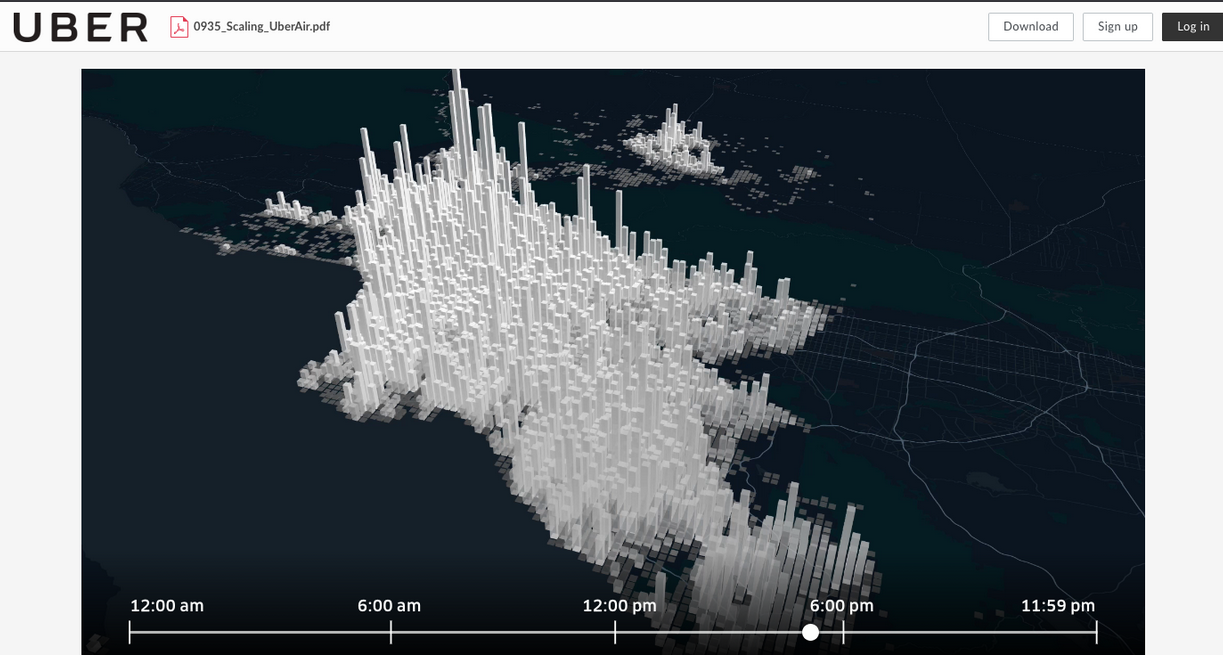
“We were extremely careful to use realistic data for our visualizations, to show what we think Uber Air can look like using our most current research,” Gervang says.

To produce the visuals, they used images captured from a cinematography app, on top of Kepler.gl. in a four-step process: planning the story, using Kepler.gl to visualize the data in motion, then a video editor to add effects that weren’t available in a browser and, finally, put them into a slide deck to add graphics. His team then repeated the process for all 17 visualizations in the keynote.

One of those maps showed an average weekday in Los Angeles and Orange counties, 45.8 million unique trips happen over a 24-hour period aggregated, into one kilometer by one kilometer tiles — here’s that bit from the keynote, it’s even more impressive with motion. The entire keynote or slides are also available.

Lime time

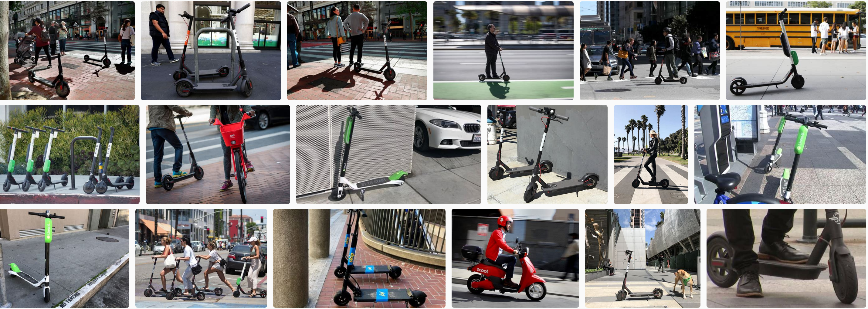
If Uber is hated enough to regularly station guards outside its Market Street headquarters, Lime has the distinction of being one of three scooter sharing companies recently booted from the streets of San Francisco.

Aash Anand, head of analytics at Lime, says the company started out in 2017 in a much less contentious space, just a “normal, not electric, bike sharing startup.” One of the visuals showed a Kepler-made map of bike patterns spidering around Greensboro, North Carolina, the first Lime town.

Anand says that speed is what gives Kepler an edge — he put together his presentation for the meetup together on the 40-minute Uber ride from Lime’s San Mateo headquarters.
“That’s actually the biggest value of Kepler has added to my life as someone who works with data,” he says. “When Lime started really growing there was no time to make things look pretty and perfect, some of these were done at lightning speed, at the request of someone in a crisis.”

What’s next

The team at Uber hopes mapmakers that will adopt Kepler — and provide feedback. As they’re planning out the next set of features —including making sharing a lot easier more visualization types, especially “cool things like flight paths” Shan He says— they are asking folks to take a survey and hashtag any projects with #keplergl. If you’re ready to try it out, try the demo or check out the GitHub repository and the tutorials on Vis Academy, a hub for visualization tutorials and classes prepared by the Uber Visualization team.

A quickie map of San Francisco’s earthquake prone skyscrapers


See full screen

See full screen – search for San Francisco if you see a world map.

The New York Times recently ran a story about San Francisco high rises – mostly downtown and South of Market – with steel frames that harbor particular risk in a quake of magnitude seven or higher. About 40 of these skyscrapers, erected before a 1994 building code outlawed a flawed welding technique, were cited in an April USGS report.

It’s one of those stories that could’ve used in interactive map at its core, but instead (it’s the news business, kid!) the map was a small, static graphic (see below) and the story ended with a list of the addresses.

Image courtesy NYT.

So here’s a simple map of those 39 steel moment-frame buildings. A few necessary caveats: this is the handiwork of a casual mapper trying out a new tool. I’ve been looking for a way to use OpenStreetMap to make personalized maps and spotted some earthquake maps from the Japanese OSM community with uMap, so it seemed worth a try. It was heavy going for a map made on the fly – the polygon tool was clunky and importing the list as a cleaned up .CSV wasn’t happening.

Still, a few things pop out: A few of these risky buildings are also near construction sites. In OSM, these are shown in sage green. (The light green represents parks.)

The struggle to use the uMap polygon tool is real. This is a closeup of 550 California Street, with a 19-story office building under construction nearby.

The Folsom Bay Tower will be a 39-story, 422-foot (129 m) residential skyscraper.

Park Tower at Transbay will have 43 stories, First & Mission’s Oceanwide Center features 636-foot-tall tower on Mission at First Street and a 910-foot-tall tower on the opposite corner on First Street.

And much like the reporter, shocked to discover the NYT offices are in one of these buildings, there were a few a-ha moments. A family member works in one and I’ve been inside at least a handful recently – an event at Autodesk, a movie at Embarcadero Center, a meetup, drinks with a friend staying at the Marriott, emerged from the Montgomery Street Station in front of one three or four times, etc.

It’s an unscientific sample size of one (well, two if you count the reporter) but would wager that most people who live or work in San Francisco are around, if not inside, these buildings frequently.

Making digital maps with pen and paper: Meet Field Papers

Field Papers is a great low-tech solution for mapping. You chose an area to map, print it, walk outside with the paper copy and mark things up, then scan or take a pic of it with the QR code and it’s added as a layer to OpenStreetMap (OSM). From there you can add your data to the largest public, editable map in the world.

It’s the handiwork of venerable design firm Stamen, who later got together with U.S. Agency for International Development (USAID) for improvements. Because it’s an open-source project whose last major changes were made five years ago and many tutorials showed the previous interface, it seemed like a good idea to test drive it.

The quick slide show above shows how it works — even if you make rookie mistakes like leaving the clipboard in your photo, duh! — the test run taking about an hour total, from figuring out how to position the map to editing in OSM.

It’s been used around the world for large mapathons, where people don’t have smartphones or OSM knowledge — you hand them sheets, they go out mapping, then they hand in the sheets and they’re done. It can be a potential bottleneck for OSM data entry after collection, but surmountable. Potentially it’s also an advantage — you can get a lot of people out mapping but only need a few with OSM knowledge or who want to learn.

Why OpenStreetMap matters: Where did Dokdo go?

One of the rocky outcrops under dispute. Photo // CC BY NC

Battle lines have always been drawn over maps. Place names are political, cultural, temporal: from Constantinople to Istanbul and Burma to Myanmar what a place is called matters.
In the digital age, however, you have no idea who is behind the changes and why.  The companies that make the maps millions of people use every day change names following opaque processes that appear to depend on who lobbies loudest at the moment. It’s a strong argument for free, public, editable maps like OpenStreetMap where both the changes and the debate are transparent.

About a week ago, I spotted this poster petitioning Google to put Dokdo back on the map at San Francisco’s Korean American Community Center of San Francisco & Bay Area.

Continue reading

Quick preview of forthcoming book “All Over the Map: A Cartographic Odyssey”

Most of us have swerved a few wrong turns or hacked through some questionable trails and cursed the map. Most of us, though, wouldn’t spend seven years and engage dozens of experts to make a better one.

Then again, most of us aren’t Bradford Washburn. This climb-every-mountain polymath was let down by the sketchy trail maps of the Grand Canyon available in 1969. At the time, age 60 and director of the Boston Science Museum, he knew what made a good map. Washburn was the first climber to scale 20,320-foot Denali and his map of the peak is still considered the definitive map of the region. A pioneer in aerial photography, he’d go on to map Mount Everest and the Presidential Range.

But it’s his National Geographic Grand Canyon map, finally published in 1978, that illustrates his “extreme dedication to the craft of map making” says Betsy Mason, co-author of Nat Geo’s All over the Map blog. Mason previewed one of the 80 stories and showed off some of the 200 maps from forthcoming book she wrote with colleague Greg Miller titled “All Over the Map: A Cartographic Odyssey” at the recent California Map Society spring meeting.

It was the best of crowds (people who readily chime in with the correct pronunciation of “theodolite” and already grasp the merits of hachuring) and the worst of crowds (after lunch on a warm Saturday) but the story behind the Grand Canyon map kept people mostly awake and ready to push over the 45-minute session limit with questions.

Mason and Miller first started the Map Lab blog back at Wired, then moved it over to National Geographic in 2013. Mason, taken with Washburn’s Grand Canyon map the first time she saw it, went archive diving at her new employer’s and found a “huge trove of boxes” about the making of the map.

Photo brewbooks on Flickr. // CC BY NC

Continue reading

Five-minute map: San Francisco’s proposed Uber/Lyft loading zones

Update: March 23, 2018. A pilot zone geofencing Lyft drivers from picking up passengers on Valencia Street has been added in the Mission. Source: Examiner.com

If you drive, walk or bike in San Francisco you know what a nightmare the ride-hailing services can be.

And if you use them often you’re probably in the habit of trying to pin yourself on a side street or a big empty parking space/driveway and pray they don’t double park while trying to find you. (Zipping past the anecdotal, it’s been calculated that 45,000 Uber and Lyft vehicles now operating in San Francisco account for more than 200,000 trips a day.)

So now the city is interested in adding ride-hailing passenger pick-up zones in a horse- trading effort to wring more data from these startups.

The San Francisco Examiner reports there are seven proposed “loading zones” and maybe one or two will be piloted. It’s a well-reported story — except that it’s missing a map. The neighborhoods are Hayes Valley, Inner Richmond, Inner Sunset, Noe Valley, North Beach, Marina and downtown.

Five minutes later with Google Maps:

A few things jump out — there’s nothing in the traffic-choked Mission district (see update above) and two “maybes” downtown. (The mapped one on Howard Street above and another potential one left unmapped since it’s described as “between Howard and Third or Fourth streets.”)

Also, once they’re mapped, if you zoom in it’s apparent that the length of these zones varies widely. The North Beach one looks like road rage waiting to happen.

San Francisco does have passenger loading zones already — white curbs with a time limit of five minutes — which in my armchair estimation (and the name “curbs”) says they’re mostly shorter than the approximately 600 feet (two blocks) of the shortest ride-hailing zones in the Richmond and Sunset…

Thoughts?

Full story over at The Examiner.

What’s under the canals of Venice? Old boats, tires and a few surprises

Image courtesy Ismar-Cnr.

Most visitors to Venice drift through the canals on gondolas taking selfies. But a group of researchers spent seven months puttering along pointing high-resolution multibeam echosounders into the waters instead. About 30 of them in all worked aboard the powerboat Litus, intent on mapping the Venice lagoon to gauge the effects of climate change on one of the world’s most improbable cities.

Research boat Litus, courtesy Ismar-CNR

While what’s under those gray-green waters isn’t exactly surprising — boat parts, old tires and containers — scientists say the underwater elevation mapping (that’s “bathymetry,” for the technically minded) comes at a critical time.

Old boats, tires and containers. Image courtesy Ismar-Cnr.

The last 100 years have radically altered the shape and ecological makeup of the lagoon, researchers say: for starters, salt marsh areas shrunk by half and underlying sediment has radically shifted. The “floating city” already struggles to stay above water in the spring and summer floods and relative sea level rise is expected to increase their frequency. The Mose system, with its 78 mobile gates that can hold back almost 10 feet of water, construction launched in 2003 and is said to be near completion in 2018.

Entrance to Malamocco port 1) Mose gate 2) 48-meter (157-foot) trench 3) the oil refinery canal. Image courtesy Ismar-Cnr.

“Before the Mose system begins to function, it was important to have a full picture of the bathymetry and currents of the tidal channels and inlets, which are the most dynamic portion of the lagoon,” researchers say in a paper published in “Nature.” They caution that the relatively rapid erosive process could threaten the stability of the “hard structures” (read: priceless palazzos) in the near future and should certainly be periodically monitored.

If you want to dig into the datasets, the scientists from research groups (Ismar-Cnr and Iim) have CC-licensed and made them available online with the paper.

A scour hole found where two channels meet. Image courtesy Ismar-Cnr.

“The data also allows us to identify areas with large dunes at the bottom and adjacent erosion sites that document the most dynamic points in the deep lagoon, where it’s important to cyclically repeat these studies to quantify the movement of sediments,” head of the study Fantina Madricardo says in the press release (translation mine.)

Part of the reason these Venice maps look so trippy (or alarming?) is due to the city’s curious geography, perching atop 118 islands bridged by canals. On most bathymetric maps, deeper waters are represented by soothing darker shades (green, blue, violet) and warmer colors (red, orange, yellow) represent shallower waters. A bathymetric map of the San Francisco Bay by comparison looks, well, a lot more soothing despite its notorious currents.