

Proving a point about data with the author’s wedding photos.
Nathan Yau is a self-appointed cicerone who shows the rest of us around the big, beautiful data visualization world.
A statistician by trade, the likeable, plain-speaking Yau runs Flowingdata.com. And, like all good tour guides, his job is to get you to think about what he’s presenting, not just drop your jaw at the sights.
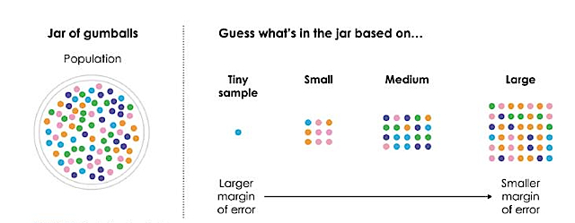
In “Data Points: Visualization That Means Something,” [public library] Yau wants you to think about sample size — even if he has to show you with a jar of gumballs. To bring home the point about data representing real life, he takes out his own wedding photos. Later in the book, he manages to transform an eye-crossingly dull table of U.S. education stats into 29 different graphics to show how it’s done.
Chew on this explanation of margin of error…
The book is a well-reasoned overview of how to present information that constantly edges away from dictating what you should or shouldn’t do. As he puts it in a note: “There are rules and design suggestions for visualization. These are fine, but you can’t just blindly follow them. Consider goals and applications.”
(My own side note: as a journalist, I’m partial to style guides. They help avoid the worst stumbles on deadline. My favorite so far is Dona Wong’s “The Wall Street Journal Guide to Information Graphics: The Dos and Don’ts of Presenting Data, Facts, and Figures.” [public library] Sometimes, you just need to know: “No donuts!”)
Yau is in an excellent position to show the lay of the land and he does it here with plenty of inspiring examples including Fernanda Viégas and Nicholas Garcia Belmonte. The author’s presentation and comparison of the two visualizations of wind patterns is thoughtful and nuanced, a bit like how an art history prof might show you two representations of The Last Supper.
The grand tour ends with a short but solid overview section of tools – organized by increasing difficulty and cost – that begs the question of just how and who will be able to put the bulk of the information in practice. Data Points is an impressive primer for learning (and discerning) what a good visualization is, but I’m unsure of the next steps.
Yau seems to know this and took a step back from emphasizing the how-to aspects of the endeavor. I embarked on his previous book, “Visualize This: The FlowingData Guide to Design, Visualization, and Statistics,” but found myself marooned at Chapter 2. My skills were pushed to the borderline there with a scraping tutorial using weather data that seemed to presume readers were both complete newbies (what’s a spreadsheet?) yet had a working knowledge of Python or would find installing that and BeautifulSoup easy-peasy. The rest of the book used examples that required statistician-friendly programming language R and the proprietary Adobe Illustrator — no-go territory for me.
Sounds like I’m a good candidate for his post on “Getting started with visualization after getting started with visualization.”
Data points: visualization that means something [review] http://t.co/AShlQ5BYOG
Data points: visualization that means something [review]: Nathan Yau is a self-appointed cicerone who… http://t.co/C8wqLnpLmB #stories