Looking at the most recent UNESCO Representative List of the Intangible Cultural Heritage of Humanity it’s clear that these “elements,” as they’re called, are all over the map.
There’s painting, weaving, pizza making and spring rituals: but while they offer up videos, photos and text — there’s no actual map of these landmarks in sight.
Making that map shines a spotlight on why organizing data is crucial — and how every organization is a data trove and should be its own best data detective. Plotting visually can inform decision making and highlight patterns – inside trends to be worked into deeper groves or used to recalucate course. The list, according to UNESCO, is “made up of those intangible heritage elements that help demonstrate the diversity of this heritage and raise awareness about its importance.” Continue reading →
Update: March 23, 2018. A pilot zone geofencing Lyft drivers from picking up passengers on Valencia Street has been added in the Mission. Source: Examiner.com
If you drive, walk or bike in San Francisco you know what a nightmare the ride-hailing services can be.
And if you use them often you’re probably in the habit of trying to pin yourself on a side street or a big empty parking space/driveway and pray they don’t double park while trying to find you. (Zipping past the anecdotal, it’s been calculated that 45,000 Uber and Lyft vehicles now operating in San Francisco account for more than 200,000 trips a day.)
So now the city is interested in adding ride-hailing passenger pick-up zones in a horse- trading effort to wring more data from these startups.
The San Francisco Examiner reports there are seven proposed “loading zones” and maybe one or two will be piloted. It’s a well-reported story — except that it’s missing a map. The neighborhoods are Hayes Valley, Inner Richmond, Inner Sunset, Noe Valley, North Beach, Marina and downtown.
Five minutes later with Google Maps:
A few things jump out — there’s nothing in the traffic-choked Mission district (see update above) and two “maybes” downtown. (The mapped one on Howard Street above and another potential one left unmapped since it’s described as “between Howard and Third or Fourth streets.”)
Also, once they’re mapped, if you zoom in it’s apparent that the length of these zones varies widely. The North Beach one looks like road rage waiting to happen.
San Francisco does have passenger loading zones already — white curbs with a time limit of five minutes — which in my armchair estimation (and the name “curbs”) says they’re mostly shorter than the approximately 600 feet (two blocks) of the shortest ride-hailing zones in the Richmond and Sunset…
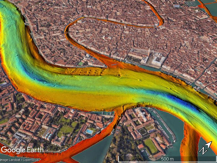
Most visitors to Venice drift through the canals on gondolas taking selfies. But a group of researchers spent seven months puttering along pointing high-resolution multibeam echosounders into the waters instead. About 30 of them in all worked aboard the powerboat Litus, intent on mapping the Venice lagoon to gauge the effects of climate change on one of the world’s most improbable cities.
Research boat Litus, courtesy Ismar-CNR
While what’s under those gray-green waters isn’t exactly surprising — boat parts, old tires and containers — scientists say the underwater elevation mapping (that’s “bathymetry,” for the technically minded) comes at a critical time.
Old boats, tires and containers. Image courtesy Ismar-Cnr.
The last 100 years have radically altered the shape and ecological makeup of the lagoon, researchers say: for starters, salt marsh areas shrunk by half and underlying sediment has radically shifted. The “floating city” already struggles to stay above water in the spring and summer floods and relative sea level rise is expected to increase their frequency. The Mose system, with its 78 mobile gates that can hold back almost 10 feet of water, construction launched in 2003 and is said to be near completion in 2018.
Entrance to Malamocco port 1) Mose gate 2) 48-meter (157-foot) trench 3) the oil refinery canal. Image courtesy Ismar-Cnr.
“Before the Mose system begins to function, it was important to have a full picture of the bathymetry and currents of the tidal channels and inlets, which are the most dynamic portion of the lagoon,” researchers say in a paper published in “Nature.” They caution that the relatively rapid erosive process could threaten the stability of the “hard structures” (read: priceless palazzos) in the near future and should certainly be periodically monitored.
If you want to dig into the datasets, the scientists from research groups (Ismar-Cnr and Iim) have CC-licensed and made them available online with the paper.
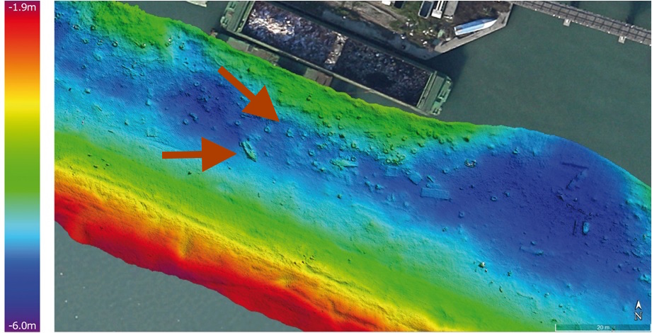
A scour hole found where two channels meet. Image courtesy Ismar-Cnr.
“The data also allows us to identify areas with large dunes at the bottom and adjacent erosion sites that document the most dynamic points in the deep lagoon, where it’s important to cyclically repeat these studies to quantify the movement of sediments,” head of the study Fantina Madricardo says in the press release (translation mine.)
Part of the reason these Venice maps look so trippy (or alarming?) is due to the city’s curious geography, perching atop 118 islands bridged by canals. On most bathymetric maps, deeper waters are represented by soothing darker shades (green, blue, violet) and warmer colors (red, orange, yellow) represent shallower waters. A bathymetric map of the San Francisco Bay by comparison looks, well, a lot more soothing despite its notorious currents.
Some kinds of reporting-by-the-numbers are anything but lazy. Take investigations looking into algorithms — examining the formulas used by the government to determine who is more likely to commit a crime or how likely your building is to have a fire inspection.
He’s been studying the wider reach of algorithms in society, government and industry for about four years, coming at it from a computer science background as a “techie who worked my way into journalism.” Boyish, bespectacled and occasionally prone to professorial turns of phrase like “algorithmic accountability,” Diakopoulos offered a look into the numbers that shape our lives. Continue reading →
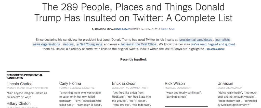
UPDATE: The Times is still tracking the list of insults — as of January 2017 it grew to 305 — and added a visualization that shows the kinds of people and things most frequently insulted. (Spoiler alert: journalists and Democrats.)
The reporters at the New York Times combed through Republican presidential nominee Donald Trump’s Twitter feed for the most recent 250 insults to nations, people and random things – including a podium.
This is the kind of story that cries out for a visual representation – there has to be a better way to process the information than listing names of the people he insulted in alphabetical order and the tweets as quotes underneath them. What story does that tell?
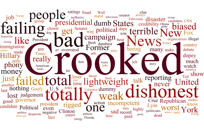
Most commonly used words in Trump insults, by frequency. By Nicole Martinelli, via Wordle.
A quick word cloud will tell you that the most common insult for the straight-talking New Yorker is “crooked” (his go-to insult for rival Hillary Clinton) followed by “dishonest,” “bad,” and “failing.”
A couple of necessary caveats: this cloud was made with a tool called Wordle and the size of the word corresponds to the number of times it appears in the text. The text in the graphic was copied and pasted from the article on the NYT site without any additional weighting or manipulation. The program automatically cuts out common words (i.e. articles) but it would be interesting to see how the cloud shifts by cutting some filler words like “new” “news” “many” “another” etc.
Digital publishing gives public figures so many ways to broadcast a message – it’s our job as journalists to make sense of it. What would you trawl through other political figures tweets to understand?
If you went by the maps available today your smartphone, you’d probably think the era of paper maps went out with the Rubik’s Cube.
But the next time you’re in a garden or park, you might come across a group of volunteers huddled around an 11×17 black-and-white printout, hopelessly trying to verify what should be where, clumsily marking it up with pencils and colored highlighters. Their work trails back indoors where it adds to a pile of similar maps that have to be verified (or interpreted?) before changes are put into the data base by a staffer. They are often printed out again and verified for accuracy.
If you write about tech, you’ll find the Associated Press Stylebook is a little bit like Dear Abby. By the time the bouffant-hair-and-matching-handbag set gets around to addressing an issue, it’s often already been answered by collective common sense.
Still, it’s nice to see the venerable news organization writing about data journalism in the same update where it finally relinquishes capitalizing the word internet.
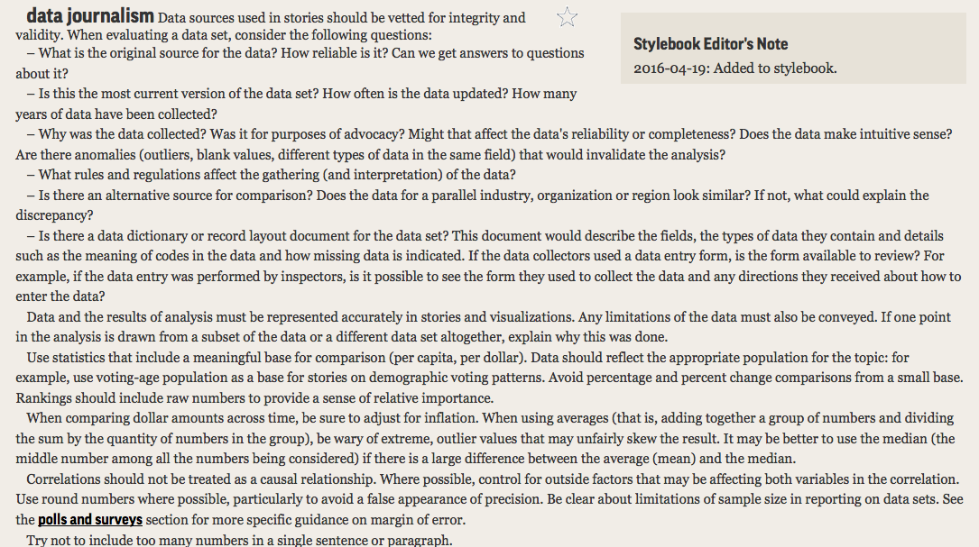
The AP Stylebook entry on data journalism, added 2016-04-19, weighs in at just under 500 words.
It begins with six rules for evaluating a data set that range from the very basic (“What is the source?”) to the kind of deep dive that may prevent you from ever filing the story (“Is there a data dictionary or record layout document for the data set – which would describe the fields, types of data they contain and details and announcing detail as indicated?”) Side note: If you’re looking for an entire book of how to present data facts and figures for journalists, my favorite is still “The Wall Street journal guide to information graphics: the dos and don’ts of presenting data, facts, and figures” by Dona M Wong. [public library]
The next section launches into the math of doing data journalism, a reminder that word people are often not numbers people. Or a reminder to all that, yeah, elementary school math is good to know.
“Avoid percentage and percent change comparisons from a small base. Rankings should include raw numbers to provide a sense of relative importance.
When comparing dollar amounts across time, be sure to adjust for inflation. When using averages (that is, adding together a group of numbers and dividing the sum by the quantity of numbers in the group), be wary of extreme, outlier values that may unfairly skew the result. It may be better to use the median (the middle number among all the numbers being considered) if there is a large difference between the average (mean) and the median.”
It heads into more advanced territory with a paragraph on causality, rounding numbers and sample size before winding up with a solid reminder for data-happy hacks: “Try not to include too many numbers in a single sentence or paragraph.”
Now we only have to wait and see how the Stylebook passes judgement on the proper abbreviation for “internet of things.”
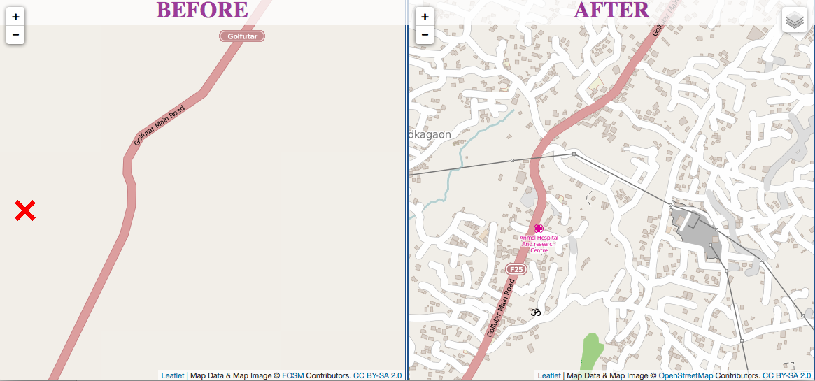
Kathmandu before and after the Humanitarian OpenStreetMap Team dived in.
Just 48 hours after Nepal’s devastating earthquake, thousands of volunteers from around the world helped create maps that guided emergency response teams.
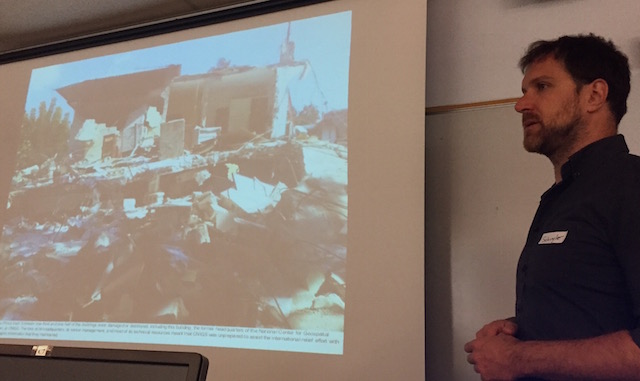
Many of these “digital humanitarians” came from OpenStreetMap, an open source mapping effort. The Humanitarian OpenStreetMap Team (HOT) in launched 2010 after the earthquake in Haiti, when the office safeguarding country’s maps pancaked in the 7.0 temblor.
Schuyler Erle shows what happened to Haiti’s mapping office after the earthquake.
This post has been developed into a talk about getting PR for your startup, if you’d like to know more, get in touch!
SAN FRANCISCO — You created an app. You think it’s awesome. Your friends say so too. Something nags at you, though: You have zero reviews, your downloads don’t outnumber your Facebook pals, and you need to make rent.
There’s a fancy name for your problem: “discoverability.” Millions of good apps face it, gathering dust between bogus fart apps and Flappy Bird clones.
“It’s hard to make a living in the App Store,” says Michael Yacavone, founder of Individuate, which makes personal-development apps Ace It! and Affirmable.
But there is definitely money to be made in the App Store, to the tune of $15 billion Apple has paid developers so far. Apple recently vowed to improve discoverability by adding an “explore” tab to the App Store, but whether users will search for new and exciting apps remains to be seen. The basic problem remains for most developers: Nearly everyone is ignoring you. Journalists can help, but you have to know how to deal with them.
At AltConf last week, developers like Yacavone got a chance to chat with tech journalists (including me) about how to garner the kind of coverage that can make or break an app. Billed as a Journalist Pitch Lab, the session felt a bit like speed dating. Some devs hit us with the equivalent of, “Hey what’s your sign?”; others just wanted to talk.
“It’s always great to get face time with journalists,” said Tara Zirker, director of social media and engagement for Imagine If, who was at the AltConf event to talk about her company’s travel app, StayAtHand.
Problematic pitching
While chatting with developers for three hours straight during the AltConf session, I noticed several problems that bubbled to the surface repeatedly.
You don’t know what your app is
You need to know how to get your product across in a sentence or two. Sometimes, people jumped straight into a demo, forcing me to half-listen, half-interpret: “So, this is a Skype/Instagram/eBay killer for the business market?” You don’t want the press wondering what it is you do, especially while you’re rocketing ahead to show off the extra-cool features. This happens all the time in email pitches.
Also, do it simply. You’re a regular person, not a carnival barker. We’re regular people too. Aim for colloquial English, the kind that lives far, far away from PowerPoint presentations. Jargon sucks.
You don’t know who it’s for, or what it’s for
Who would use this app? Why would they want it? This isn’t always as obvious as it seems. And, if you’re touting features like social sharing, be able to answer why your users would want to do that — just because you can include a feature doesn’t mean you should. Or that someone would want to use it. Most journalists avoid buzz-features du jour with the same vehemence that they would steer clear of a “mocktail” hour.
You don’t know what goes into (or should be left out of) a press release
If you’re reaching out on your own to journalists, keep it simple. Don’t link to a “press kit” or point them to a video if your concept can be explained simply. Avoid terms like “exclusive” and “embargo” (it’s gone the way of the CB radio) — they will only increase your chances of getting ignored or into trouble. Make sure you cover the 5 Ws (who, what, when, where, why and how) and include your preferred contact info for quick follow-up. Then forget that it’s a “press release” at all and write like a normal person. Proofread it. Hit send. Repeat, repeat, repeat.
You don’t know that you’re part of the story
If your personal life/background is relevant to your company story, use it to hook interest. Are you a former Apple employee? That’s worth mentioning sooner rather than later. Did you spend 20 years in the food industry before teaching yourself to code a cooking app? Bring that to the table when you’re pimping your story.
It can be a simple sentence or two in a short email — depending on whether your focus is getting product coverage (new release, you just won an award) or a less timely, profile-type piece. But if you are the story, know that going in.
Tara Zirker shows the StayAtHand travel app to MacRumors’ Arnold Kim during AltConf’s Journalist Pitch Lab. Photo: Jim Merithew
You think of yourself as a product, not a source
No app is an island. You may want blanket coverage when you’ve got news, but that’s a numbers game where the odds are against you. You could send out hundreds of emails and get zero coverage in return. A week later, you’re not news anymore, and no one knows you’re out there.
Know the hot-button issues and the seasonality of your industry. Think about your App Store category — fitness? health? dating? It’s easy to pitch marriages sparked by dating apps in early February but an uphill climb to pitch any news about a ski app in the summer.
Consider yourself a source. If you’re an award-winning, cross-platform indie developer with something to say about Swift, we want to hear it when news breaks. Or maybe you’re a designer having to tweak iOS 8 for your clients because of legibility issues that you haven’t read about anywhere yet.
Go to the publications that you regularly read, search for the topic (or your competitors) and fire off a short email to the reporter. Tell them you know they cover the topic, what your point is, why you think your point is interesting/new/different and end with the best way to contact you for a follow-up. Proofread your email and consider anything you write a quote – in other words, it could end up published.
Monitor coverage of your competitors. (Google alerts are perfect for this.) Mainstream media is a great place to look for big ideas: Did USA Today just run a piece on the next generation of travel apps? That story will be passed around in more ways than a nimble young lass at a square dance competition. Find a way to be a part of it.
If you have a company or personal blog, write about that article and put your own spin on it. The same day, if possible. And get it out using the names of your biggest competitors in the social media blast. It might get picked up in the blogosphere – that endless hall of mirrors reflecting publications of varying size and slant.
Also, write that USA Today reporter a short note, telling them either what you liked or what they got wrong (gently, this last one), how you fit into the picture, and what makes you stand out from the pack. Ask that they consider you a source for future stories and provide the best way to contact you. Freelancers may be able to get you into a different publication as they re-spin the story. Also, journos switch jobs frequently. And they also help each other out by trading smart sources who respond quickly.
If you develop relationships with reporters at other publications, write them about it, too, finding a way to push the story forward. An incisive sentence or two about what the implications are or what may happen next given the upcoming legislative hearing and bam! You’re quoted in a post and become part of the echo chamber.
You don’t know if you need a PR firm or not
Should you interface with the press yourself – or do you need a public-relations person to help you out? Consider this: If you are easily hurt, clueless about all of the above, have no time and are super-nervous about the way you speak or write, get a publicist. They can help you determine where you fit into the news and make you look good until you get the hang of it. Ask them how they will position you and what they think your story is — it will help you to get an outside opinion. Caveat: They cannot (and should not) guarantee that you will get massive coverage. However, they may cut down on the wear and tear to you in the process.
Otherwise, it may be better to go solo. According to the United States Bureau of Labor Statistics, public relations professionals outnumber reporters about four to one. Journalists are being slowly suffocated under the weight of press releases, many of them not better (and certainly not more personal) than you could write yourself. I can count the number of interesting, relevant emails from actual people sent to me, personally, without taxing my brain as much as calculating a restaurant tip does. And I’ve ended up writing about almost all of them.
You don’t know the answers to six difficult questions
Any reporter worth that title will ask you something you’d rather not answer, sooner or later. Think ahead about what you’re going to say. Keep it simple. Jargon sucks and, in the face of a tough question, it’s easier to see through than Kim Kardashian’s blouse.
Some standard toughies:
“Why should my readers care?” “Who are your competitors and why are you different/better?” “Where’s the money coming from?” “What’s your business model? “Is this really anything new, after XYZ already did it?” “What about privacy/legal issues/data, etc.?”
That’s basically it. If you have more questions about how to deal with the press, ask me in the comments or email me directly.