Stories, Stats & Scatterplots: Inside data visualization at the Financial Times

Four years ago, John Burn-Murdoch was a journalist who had never written a line of code. These days, the senior data visualization journalist at the Financial Times says he rarely writes anything but code.

While what Burn-Murdoch dubs a “cool journey” sounds a little extreme (from zero to R, on the job, seriously?), he was never strictly a text journalist. He holds advanced degrees in data science and interactive journalism. Before landing at the FT, he worked as data journalist at The Guardian for two years.

On loan from the London headquarters to focus on bias in artificial intelligence and geographical inequality, the spiky-haired, elfin Burn-Murdoch offered a peek inside the workings of the FT data newsroom for about 50 members of the Bay Area d3 User Group.

Continue reading

How to investigate your government through algorithms

Some kinds of reporting-by-the-numbers are anything but lazy. Take investigations looking into algorithms — examining the formulas used by the government to determine who is more likely to commit a crime or how likely your building is to have a fire inspection.

Speaking at the recent International Festival of Journalism, Nick Diakopoulos, assistant professor at the University of Maryland’s Philip Merrill College of Journalism and a member of its Human Computer Interaction Lab, gave a solid primer on how to get started.

He’s been studying the wider reach of algorithms in society, government and industry for about four years, coming at it from a computer science background as a “techie who worked my way into journalism.” Boyish, bespectacled and occasionally prone to professorial turns of phrase like “algorithmic accountability,” Diakopoulos offered a look into the numbers that shape our lives. Continue reading

Crooked! Donald Trump’s most recent insults as a word cloud

UPDATE: The Times is still tracking the list of insults — as of January 2017 it grew to 305 — and added a visualization that shows the kinds of people and things most frequently insulted. (Spoiler alert: journalists and Democrats.)

The reporters at the New York Times combed through Republican presidential nominee Donald Trump’s Twitter feed for the most recent 250 insults to nations, people and random things – including a podium.

NYtimesThis is the kind of story that cries out for a visual representation – there has to be a better way to process the information than listing names of the people he insulted in alphabetical order and the tweets as quotes underneath them. What story does that tell?

Most commonly used words in Trump insults, by frequency.

Most commonly used words in Trump insults, by frequency. By Nicole Martinelli, via Wordle.

A quick word cloud will tell you that the most common insult for the straight-talking New Yorker is “crooked” (his go-to insult for rival Hillary Clinton) followed by “dishonest,” “bad,” and “failing.”

A couple of necessary caveats: this cloud was made with a tool called Wordle and the size of the word corresponds to the number of times it appears in the text. The text in the graphic was copied and pasted from the article on the NYT site without any additional weighting or manipulation. The program automatically cuts out common words (i.e. articles) but it would be interesting to see how the cloud shifts by cutting some filler words like “new” “news” “many” “another” etc.

Digital publishing gives public figures so many ways to broadcast a message – it’s our job as journalists to make sense of it. What would you trawl through other political figures tweets to understand?

The Associated Press Stylebook weighs in on data journalism

bye3nzmg6q355a3splxzCC-licensed, via hatalamas on Flickr.

If you write about tech, you’ll find the Associated Press Stylebook is a little bit like Dear Abby. By the time the bouffant-hair-and-matching-handbag set gets around to addressing an issue, it’s often already been answered by collective common sense.

Still, it’s nice to see the venerable news organization writing about data journalism in the same update where it finally relinquishes capitalizing the word internet.

The AP Stylebook entry on data journalism, added 2016-04-19, weighs in at just under 500 words.

It begins with six rules for evaluating a data set that range from the very basic (“What is the source?”) to the kind of deep dive that may prevent you from ever filing the story (“Is there a data dictionary or record layout document for the data set – which would describe the fields, types of data they contain and details and announcing detail as indicated?”) Side note: If you’re looking for an entire book of how to present data facts and figures for journalists, my favorite is still “The Wall Street journal guide to information graphics: the dos and don’ts of presenting data, facts, and figures” by Dona M Wong. [public library]

Screen Shot 2016-06-02 at 1.47.30 PMThe next section launches into the math of doing data journalism, a reminder that word people are often not numbers people. Or a reminder to all that, yeah, elementary school math is good to know.

“Avoid percentage and percent change comparisons from a small base. Rankings should include raw numbers to provide a sense of relative importance.
When comparing dollar amounts across time, be sure to adjust for inflation. When using averages (that is, adding together a group of numbers and dividing the sum by the quantity of numbers in the group), be wary of extreme, outlier values that may unfairly skew the result. It may be better to use the median (the middle number among all the numbers being considered) if there is a large difference between the average (mean) and the median.”

It heads into more advanced territory with a paragraph on causality, rounding numbers and sample size before winding up with a solid reminder for data-happy hacks: “Try not to include too many numbers in a single sentence or paragraph.”

Now we only have to wait and see how the Stylebook passes judgement on the proper abbreviation for “internet of things.”

Mapping where your iPhone got lost or stolen

I am not a psychic, but I have a good idea where you and your iPhone parted ways.

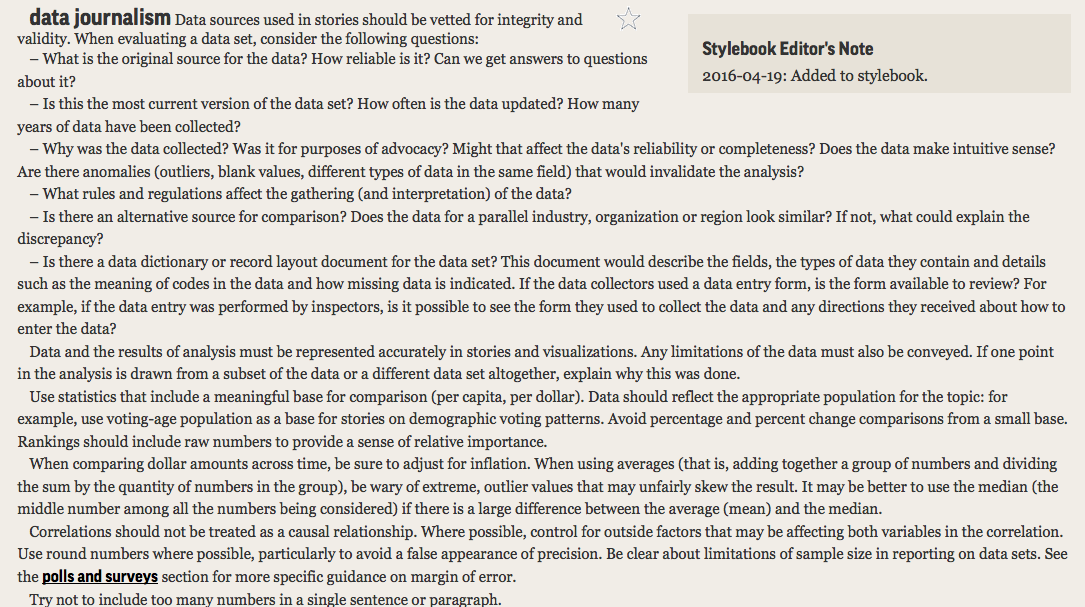
If you’re desperately seeking it on Craigslist, chances are you lost your device – or had it stolen – over the weekend, especially at night. And probably at some fun destination – shopping, the beach, a bar – or heading there on your usual means of transportation (the car, a gas station or parking lot, or bus).

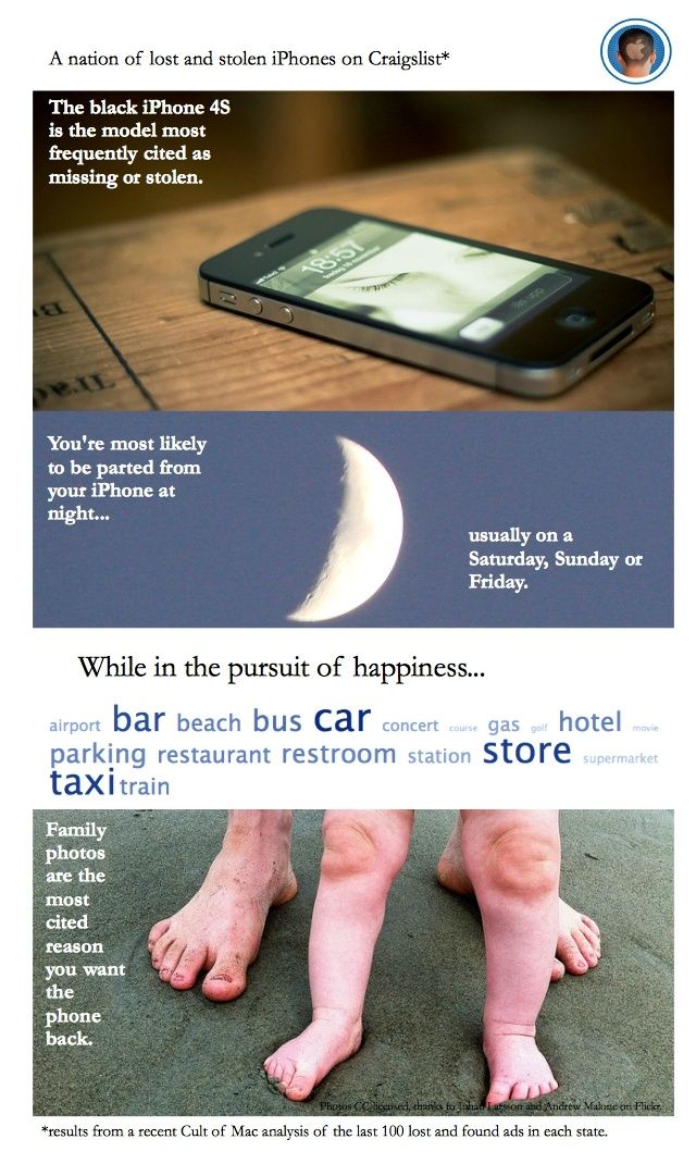
Although your entire work life might be on it, you are pleading with the person who found it (or swiped it) to return your iPhone because those photos of your dog or kid or grandma can never be replaced.

This is the most common tale to emerge from Cult of Mac’s recent analysis of hundreds of iPhone lost and found ads on Craigslist blanketing the entire United States. (Here’s the backstory on how I did it using Python, if you’re interested.)

Stealing iPhones (“Apple picking”) now accounts for about half the crimes in cities like San Francisco and New York; it’s hard to say how many absent-minded drinkers leave them at bars, but if you find a phone and don’t return it, in many places that becomes theft by finding.

Police and Apple diverge on what to do about it. The Cupertino company advises you to notify police, while some authorities are urging phone makers and service providers to add a kill switch to curb thefts.

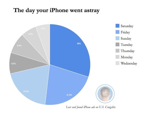
Apple’s “Find my iPhone” can help, unless the savvy crook pops out the SIM card or wipes the contents of your phone and starts over. This gray area has inspired some derring-do recoveries, like outing the thief or the finder-who-wants-to-be-keeper by staging a diabolical seduction. Not recommended.

stores

In the meantime, if you’re hoping someone will return your lost iPhone or realize they’ve bought stolen goods and do the right thing, you’re probably heading to Craigslist.

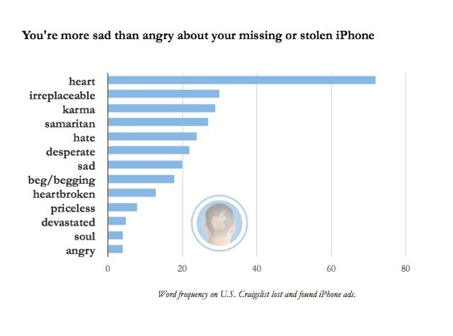
Generally speaking, you’re more likely to offer heartfelt thanks than a reward for the return of your phone. Unless you live in a place such as Washington, D.C. or Michigan, then you’re ready to bust out the cash.

After combing through these ads for the project, I bought an ugly white case for my black iPhone 4S to make it easier to see in the pitch of all of my dark bags and on taxi seats, etc. As a result, I am having fewer of those “where’s my goddamn phone?” moments.

Have you lost your iPhone? How did you recover it? Let me know in the comments.

First published at Cult of Mac.

Painful lessons in data journalism: scraping with Python

3932023011_32e5e18838_z

Lost in the woods. CC-licensed, Chris-Håvard Berge on Flickr.

Lost and found ads can be a good way to sniff out a story.

Take the ones on Craigslist about iPhones. There’s a woman who gained a husband in a quickie wedding at city hall but left her iPhone behind. Or a drunk college kid who dropped his phone on the passenger seat of a good samaritan who took him home.

Is there a bigger story about lost and stolen iPhones? To find out, I scraped all 50 states of Craigslist lost and found ads using Python and BeautifulSoup. If you want to check out or improve that code, it’s on GitHub. Here’s the full story, with charts and things!

The project required more fist clenching and eye straining than anticipated – even though writing a basic scraper for Craigslist is considered an easy-peasy programming project.

Let me just say it: as a novice Pythonista, I am challenged by nearly everything. I mean, command line interface, seriously? But I can get past that. I slogged through (and recommend) Learning Python the Hard Way, as well as finished some examples in Scraping for Journalists.
Continue reading