
Four years ago, John Burn-Murdoch was a journalist who had never written a line of code. These days, the senior data visualization journalist at the Financial Times says he rarely writes anything but code.
While what Burn-Murdoch dubs a “cool journey” sounds a little extreme (from zero to R, on the job, seriously?), he was never strictly a text journalist. He holds advanced degrees in data science and interactive journalism. Before landing at the FT, he worked as data journalist at The Guardian for two years.
On loan from the London headquarters to focus on bias in artificial intelligence and geographical inequality, the spiky-haired, elfin Burn-Murdoch offered a peek inside the workings of the FT data newsroom for about 50 members of the Bay Area d3 User Group.
meetup tonight ?
@jburnmurdoch @D3BayArea
on Datavis at the Financial Times ?
? https://t.co/LXeYOY93DF pic.twitter.com/1Xblslbxg7— @micahstubbs (@micahstubbs) June 26, 2018
Getting started
To crank out the visuals on a 24/7 website and daily newspaper with global reach, the team refers the visual vocabulary chart plastered the wall of the newsroom that Burn-Murdoch describes as a “thinking and planning device.”
Developed by Alan Smith, data visualization editor, it offers a first step to deciding what kind of graphic best suits the data. Trade surplus/deficit, climate change? Try a diverging bar or maybe a surplus/deficit filled line. Looking to make a point about inflation and unemployment, income and life expectancy? See if a scatterplot, connected scatterplot, a bubble chart or an XY heat map works best.
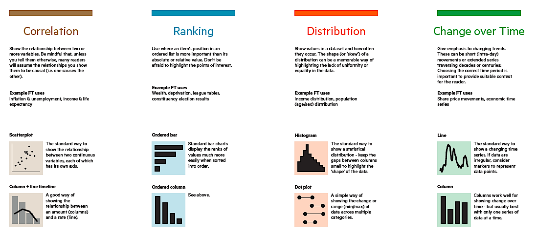
An excerpt from the Visual Vocabulary chart.
And while it’s not meant to be a definitive guide or a wizard, it serves to remind people that “data is something that the FT does,” and as a guide to talk through options with editors and writers who aren’t data fluent. It also helps demonstrate that “we’re a team of intelligent people who make smart decisions,” he says,”not just some people drawing over there in the corner.” You can download it at ft.com/vocabulary and find templates for these at the ft-interactive repository on GitHub.
How data gets into the paper: Three workflows
In order of increasing difficulty and time, there are three main workflows for data vis at the FT:
FastCharts
In under a minute, bar and line charts. These are available to the entire newsroom with a single sign-in; journalists who want to dive into visuals often use these. “Not all of them do but in general we have a very numerate newsroom,” Burn-Murdoch says. For quality control purposes, the charts are constrained by type (stock prices, GDP) and while you can customize, “you can’t make a bad chart — you get an error message.” Other pros: it’s integrated into the content management system, making the work saveable and editable – so they can be reused and updated as needed. These were built from Victory Chart.
VisualVocabulary charts
These are d3 templates mainly used for same-day graphics. While you don’t need d3 knowledge to use them, they can be customized if the journos are willing to learn. These aren’t as newbie friendly but are now used by more folks outside data vis, including the social media team.
What are people’s #dataviz tool breakpoints? Which tools for which tasks?
Mine:
— Gathering & exploring data as I go, so chart forms may change midway through: ggplot
— Interactive or dynamic: d3 and or canvas+js
— Full creative control, custom geoms, colour gradients etc: d3— John Burn-Murdoch (@jburnmurdoch) June 25, 2018
ggplot
Burn-Murdoch has been chipping away at making the plotting system for Python based on R production ready on the typical newsroom needed-it-five-minutes-ago timetable.
He demoed his “third concerted attempt” to produce with gg plot and get the right fonts, etc. as an example of failing fast at the FT and increasing fluency in the Grammar of Graphics.
Charting a cracking story
The other main takeaway is a welcome reminder that news rules data visualization. “Our mission is to really prioritize storytelling, impart insight and make a point,” he says, adding that you can spend almost as much time crafting a good title for a chart as you can messing around with the data. Instead of the self explanatory (“Life expectancy in Blackpool”) title, it helps to think of it as a standalone news piece (“Boys born in Blackpool can expect to live just 74 years — the second lowest in the UK.”)
In response to a question about how he convinces journalists to understand his work, he says what’s evolved is his own understanding of what makes good data visualization, saying some of his early attempts didn’t necessarily translate into incisive news content.
In contrast, he offered up a map of Italy’s most recent election results — scraped overnight from a government website that launched the day of the elections — that made it into the paper the next morning. “I want the other papers to wake up, think about the visuals they want to make and realize that we’ve already done it.”