SAN FRANCISCO — Shan He may hold Silicon Valley’s most meta job.
“When I started out, I was building maps. Then I moved on to build tools to build maps and now I’m doing tools to do tools that build maps.”
He, who dumped brick-and-mortar architecture studies for computational design, joined Uber as founding member of the data visualization team in 2014. She went on to construct Kepler.gl, a tool that helps make “beautiful maps in like 10 seconds” — without any coding. Built using the deck.gl WebGL data visualization framework, the ride-sharing company recently open-sourced the geospatial toolbox that can be used with QGIS, Carto and Mapbox Studio. Given its origins, it’s easy to see why Kepler excels at large-scale visualizations centering on geolocations.
This second #keplergl map shows the height of buldings in @TelAviv pic.twitter.com/8BSSy9Rogc
— Eliav S-T (@est987) July 11, 2018
She set the stage for a recent standing-room-only meetup hosted by Mapbox for two case studies on what the tool can do and how you can get involved.
Catching air inside Uber
Chris Gervang, software engineer at Uber, started playing around with Kepler.gl without alerting his data vis team colleagues to his tinkering. Gervang works on one of the Valley’s most (ahem) pie-in-the-sky initiatives: an urban air transportation project dubbed Elevate. The second Uber Elevate summit featured a keynote by the head of aviation, Eric Allison, that would’ve fallen flat if not bolstered with stunning maps.
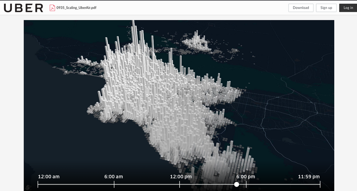
Titled “Scaling Uber Air,” it featured data visualizations to show everything the company knows about how people move around in cities and how to use that to model the future Uber air network.
 “We were extremely careful to use realistic data for our visualizations, to show what we think Uber Air can look like using our most current research,” Gervang says.
To produce the visuals, they used images captured from a cinematography app, on top of Kepler.gl. in a four-step process: planning the story, using Kepler.gl to visualize the data in motion, then a video editor to add effects that weren’t available in a browser and, finally, put them into a slide deck to add graphics. His team then repeated the process for all 17 visualizations in the keynote.
One of those maps showed an average weekday in Los Angeles and Orange counties, 45.8 million unique trips happen over a 24-hour period aggregated, into one kilometer by one kilometer tiles — here’s that bit from the keynote, it’s even more impressive with motion. The entire keynote or slides are also available.
Avec #keplergl , on peut visualiser les données des sauvetages en mer en 3 minutes chrono sans une ligne de code ! https://t.co/F9Bjoga0zT https://t.co/IIPBCyFju5 #dataviz pic.twitter.com/3I1osS7bI1
— PA Chevalier (@pa_chevalier) July 3, 2018
Lime time
If Uber is hated enough to regularly station guards outside its Market Street headquarters, Lime has the distinction of being one of three scooter sharing companies recently booted from the streets of San Francisco.
Aash Anand, head of analytics at Lime, says the company started out in 2017 in a much less contentious space, just a “normal, not electric, bike sharing startup.” One of the visuals showed a Kepler-made map of bike patterns spidering around Greensboro, North Carolina, the first Lime town.
 Anand says that speed is what gives Kepler an edge — he put together his presentation for the meetup together on the 40-minute Uber ride from Lime’s San Mateo headquarters.
“That’s actually the biggest value of Kepler has added to my life as someone who works with data,” he says. “When Lime started really growing there was no time to make things look pretty and perfect, some of these were done at lightning speed, at the request of someone in a crisis.”
What’s next
The team at Uber hopes mapmakers that will adopt Kepler — and provide feedback. As they’re planning out the next set of features —including making sharing a lot easier more visualization types, especially “cool things like flight paths” Shan He says— they are asking folks to take a survey and hashtag any projects with #keplergl. If you’re ready to try it out, try the demo or check out the GitHub repository and the tutorials on Vis Academy, a hub for visualization tutorials and classes prepared by the Uber Visualization team.


