Spot the difference: The new Apple maps

As a kid, I had a total thing for those “spot the difference” cartoons.

Here’s a look at what I found with the new Apple Maps for San Francisco, want to play* along?

(*Every attempt was made to frame maps at same zoom level but no scientific-y methods were employed to do this.)

Driving directions from Cupertino to San Francisco

Click to expand. Old version on the left. In the new version the option to show traffic and 3D are always in frame.

Continue reading

Adventures in data cleaning: Did the New York Times undercount risky San Francisco skyscrapers?

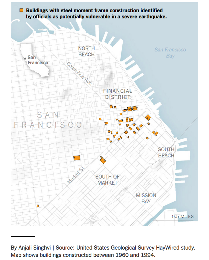
It looks like the New York Times may have undercounted the number of risky skyscrapers in downtown San Francisco, 48 instead of 39. It’s a seemingly small difference – 20 percent if you do the math – but it’s significant if you consider how many people work in these large buildings. A June 15 story focused on steel moment buildings cited in a USGS report.

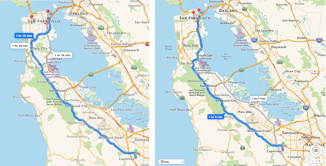
I made a quick map using the addresses from the NYT story, then I wanted to make one that included photos of the buildings. This time I went directly to the report, noticing that the first address wasn’t listed in the story, it seemed like a good idea to see if there were any more discrepancies.

TL;DR

To check how I got them:

  • The USGS report, starting on page 360, in .PDF
  • The .KML file I made, for more fact-checking and map making (pretty please send links to your maps or put them in the comments – I’m a casual mapper, using new tools and working quickly!)
  • Here are the additional nine addresses from the report that weren’t in the NYT story:
  1. The Mills Building, 221 Montgomery Street
  2. 225 Bush Street
  3. 140 Montgomery Street
  4. 120 Montgomery Street
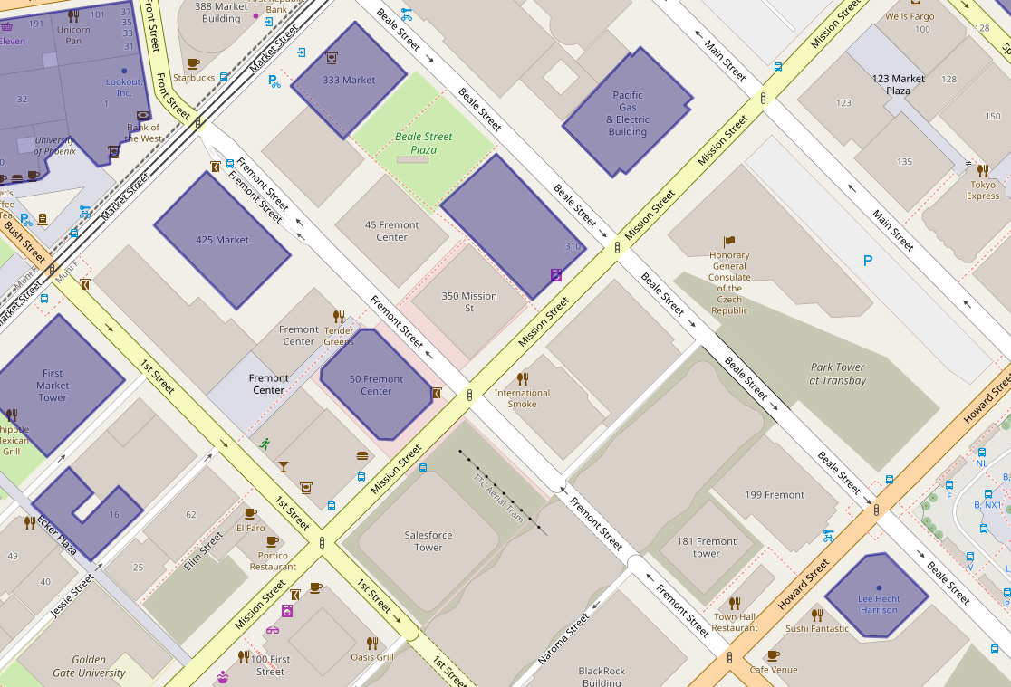
  5. 45 Fremont Street
  6. 55 2nd Street
  7. 555 Mission Street
  8. 611 Folsom Street
  9. 680 Folsom Street

The clumsy adventure

To start, I downloaded the 454-page .PDF, then extracted five pages with the buildings listed by using the >Print>Pages>Save as .PDF function in Preview for Mac. Then I converted the .PDF to .CSV with Sejda. After that, it was time for Terminal to merge the extracted data from those pages into one file with the command:

cat *.csv >merged.csv

Still too messy to be useful without a lot of tedious cleanup:

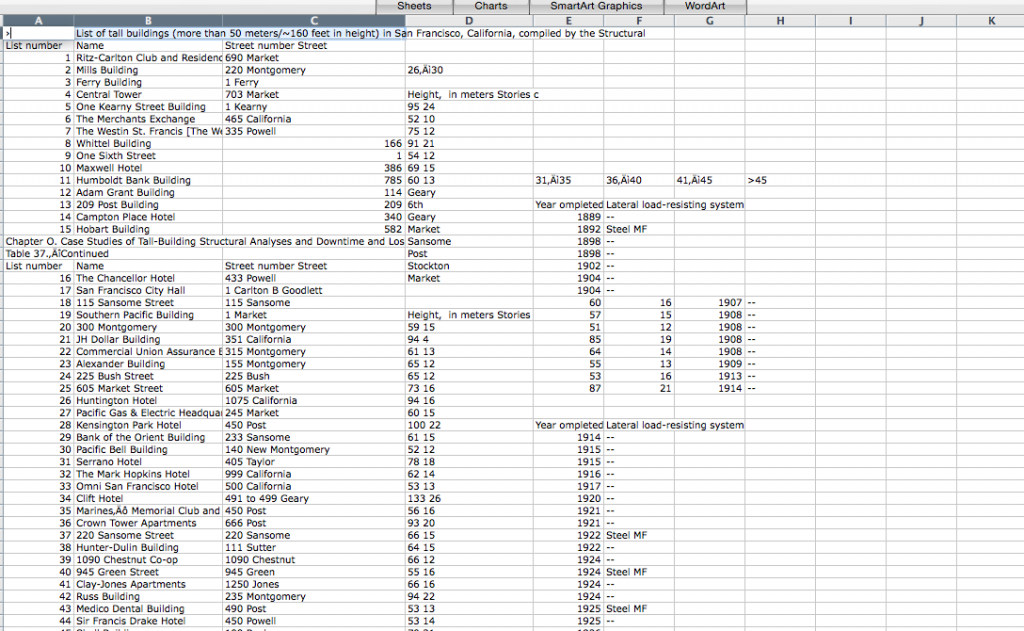
So I tried the quickest and dirtiest way I know: copy the table from the .PDF into Word, then from Word (where it’s recognized as a table) copy it into Excel.

There are a couple hundred buildings listed, but the ones cited in the story are steel moment frames. Erected before a 1994 building code outlawed a flawed welding technique, they harbor particular risk in a quake of magnitude seven or higher.

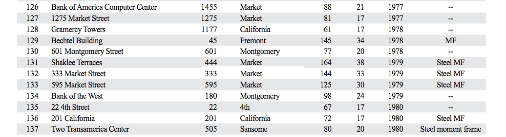
From the USGS report: Steel moment frame listed as “Steel MF,” “Steel moment frame” and “MF.”

From there it was a question of sorting the buildings listed as “Steel MF,” noting that a couple are listed alternatively as “Steel moment frame” and one as simply as “MF.” Messy messy messy: also, totally typical. (There were also about 15 more listed as Steel MF in combination with some other reinforcement, since it would require more reporting to figure out if they’re as risky, these were left out.)

Then I checked the addresses against the story, added polygons for the nine new addresses to the previous uMap, downloaded it as a .KML file and started playing around in Google Maps.

The resulting map is a little disappointing. For starters, the polygons from uMap (which uses OpenStreetMap) don’t jibe that well with Google. As for the images – since the real a-ha if you live or work in San Francisco is how many of these buildings you’re in or around – I always forget how bad these are in the noob version of Google Maps. When you’re editing in the map, they are Polaroid-style pop-ups that resize whatever pic you throw in. 
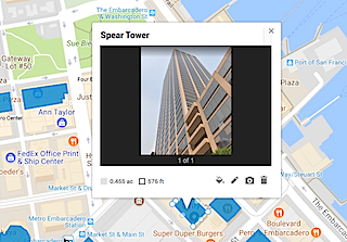
The published version looks nothing like that and the overall effect with these building shots (all vertical) is horrific. Ugh. There’s no way to resize the window from this version of Google Maps – the alternatives are Google Fusion tables (which wouldn’t solve the problem here since AFAIK it works with points, not polygons) or  programming via the Google Maps API.

Why this happened

So how did the New York Times undercount the number of especially shaky high rises? Going on my experience with newsrooms (long) and with data (short but painful) my first guess is that the USGS mistakenly gave the Times an Excel or .CSV file that was different from what ended up in the final report.

The reporter knew there were enough buildings to warrant a story, somewhere around 40, the graphics person had the file, made the map and those numbers were plugged into the story and fact checked without going back to the published report.

Or there was some glitch between the formats – given how annoying the process of getting information from .PDF into anything – it’s easy enough. Data cleaning is the least interesting, most tedious part of any project. In this case, if I’m right, there are 20 percent more risky buildings than originally reported.

A quickie map of San Francisco’s earthquake prone skyscrapers


See full screen

See full screen – search for San Francisco if you see a world map.

The New York Times recently ran a story about San Francisco high rises – mostly downtown and South of Market – with steel frames that harbor particular risk in a quake of magnitude seven or higher. About 40 of these skyscrapers, erected before a 1994 building code outlawed a flawed welding technique, were cited in an April USGS report.

It’s one of those stories that could’ve used in interactive map at its core, but instead (it’s the news business, kid!) the map was a small, static graphic (see below) and the story ended with a list of the addresses.

Image courtesy NYT.

So here’s a simple map of those 39 steel moment-frame buildings. A few necessary caveats: this is the handiwork of a casual mapper trying out a new tool. I’ve been looking for a way to use OpenStreetMap to make personalized maps and spotted some earthquake maps from the Japanese OSM community with uMap, so it seemed worth a try. It was heavy going for a map made on the fly – the polygon tool was clunky and importing the list as a cleaned up .CSV wasn’t happening.

Still, a few things pop out: A few of these risky buildings are also near construction sites. In OSM, these are shown in sage green. (The light green represents parks.)

The struggle to use the uMap polygon tool is real. This is a closeup of 550 California Street, with a 19-story office building under construction nearby.

The Folsom Bay Tower will be a 39-story, 422-foot (129 m) residential skyscraper.

Park Tower at Transbay will have 43 stories, First & Mission’s Oceanwide Center features 636-foot-tall tower on Mission at First Street and a 910-foot-tall tower on the opposite corner on First Street.

And much like the reporter, shocked to discover the NYT offices are in one of these buildings, there were a few a-ha moments. A family member works in one and I’ve been inside at least a handful recently – an event at Autodesk, a movie at Embarcadero Center, a meetup, drinks with a friend staying at the Marriott, emerged from the Montgomery Street Station in front of one three or four times, etc.

It’s an unscientific sample size of one (well, two if you count the reporter) but would wager that most people who live or work in San Francisco are around, if not inside, these buildings frequently.

Geographer maps San Francisco’s bike politics

Copenhagen has a lot more in common with San Francisco than most people think, says San Francisco State geography professor Jason Henderson.

While many look to the capital of Denmark as a Nordic idyll where the drin of bicycle bells outnumbers the blare of car horns, Henderson says it went through the same political fights to get there. “It’s not a magical unique place, actually, and that opens up the doors to possibility,” says Henderson, who spent a 2016 research sabbatical in Copenhagen and has a forthcoming book about the two cities.

Speaking at a recent Nerd Nite, Henderson gave some gears to grind as San Francisco heads into June 5 elections. Politics matter – how streets are configured, how much car ownership is taxed, how much space is allocated and protected for car parking and who decides these issues – and the daily habits of politicians matter, too.

“It’s important if we’re going to have not just a bicycle city but a truly sustainable transportation city,” he says. The problem? Few San Francisco politicians are really behind the bike as a method of transportation. Continue reading

Five-minute map: San Francisco’s proposed Uber/Lyft loading zones

Update: March 23, 2018. A pilot zone geofencing Lyft drivers from picking up passengers on Valencia Street has been added in the Mission. Source: Examiner.com

If you drive, walk or bike in San Francisco you know what a nightmare the ride-hailing services can be.

And if you use them often you’re probably in the habit of trying to pin yourself on a side street or a big empty parking space/driveway and pray they don’t double park while trying to find you. (Zipping past the anecdotal, it’s been calculated that 45,000 Uber and Lyft vehicles now operating in San Francisco account for more than 200,000 trips a day.)

So now the city is interested in adding ride-hailing passenger pick-up zones in a horse- trading effort to wring more data from these startups.

The San Francisco Examiner reports there are seven proposed “loading zones” and maybe one or two will be piloted. It’s a well-reported story — except that it’s missing a map. The neighborhoods are Hayes Valley, Inner Richmond, Inner Sunset, Noe Valley, North Beach, Marina and downtown.

Five minutes later with Google Maps:

A few things jump out — there’s nothing in the traffic-choked Mission district (see update above) and two “maybes” downtown. (The mapped one on Howard Street above and another potential one left unmapped since it’s described as “between Howard and Third or Fourth streets.”)

Also, once they’re mapped, if you zoom in it’s apparent that the length of these zones varies widely. The North Beach one looks like road rage waiting to happen.

San Francisco does have passenger loading zones already — white curbs with a time limit of five minutes — which in my armchair estimation (and the name “curbs”) says they’re mostly shorter than the approximately 600 feet (two blocks) of the shortest ride-hailing zones in the Richmond and Sunset…

Thoughts?

Full story over at The Examiner.

Mayor busts out infographic to summarize San Francisco’s state of the city

Infographic of the state of San FranciscoSan Francisco Ed Lee busted out an infographic to summarize his three-hour “State of the City” address for the nerds assembled at the TechCrunch Crunchies. Lee always reminds me of that affable uncle about to tell you a pun at some ghastly family function, so I don’t think he did it entirely seriously – see the Super Bowl wins at the center. It’s an interesting idea, though, releasing a snapshot of a long presentation that most locals didn’t see in a digestible format.