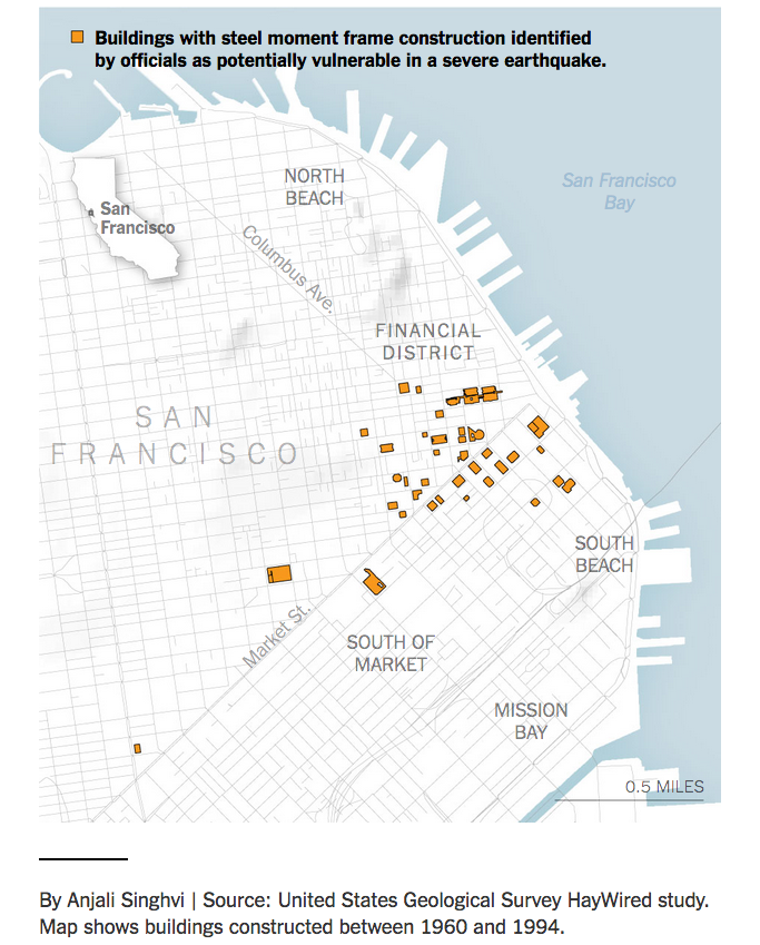
It looks like the New York Times may have undercounted the number of risky skyscrapers in downtown San Francisco, 48 instead of 39. It’s a seemingly small difference – 20 percent if you do the math – but it’s significant if you consider how many people work in these large buildings. A June 15 story focused on steel moment buildings cited in a USGS report.
I made a quick map using the addresses from the NYT story, then I wanted to make one that included photos of the buildings. This time I went directly to the report, noticing that the first address wasn’t listed in the story, it seemed like a good idea to see if there were any more discrepancies.
TL;DR
To check how I got them:
- The USGS report, starting on page 360, in .PDF
- The .KML file I made, for more fact-checking and map making (pretty please send links to your maps or put them in the comments – I’m a casual mapper, using new tools and working quickly!)
- Here are the additional nine addresses from the report that weren’t in the NYT story:
- The Mills Building, 221 Montgomery Street
- 225 Bush Street
- 140 Montgomery Street
- 120 Montgomery Street
- 45 Fremont Street
- 55 2nd Street
- 555 Mission Street
- 611 Folsom Street
- 680 Folsom Street
The clumsy adventure
To start, I downloaded the 454-page .PDF, then extracted five pages with the buildings listed by using the >Print>Pages>Save as .PDF function in Preview for Mac. Then I converted the .PDF to .CSV with Sejda. After that, it was time for Terminal to merge the extracted data from those pages into one file with the command:
cat *.csv >merged.csvStill too messy to be useful without a lot of tedious cleanup:
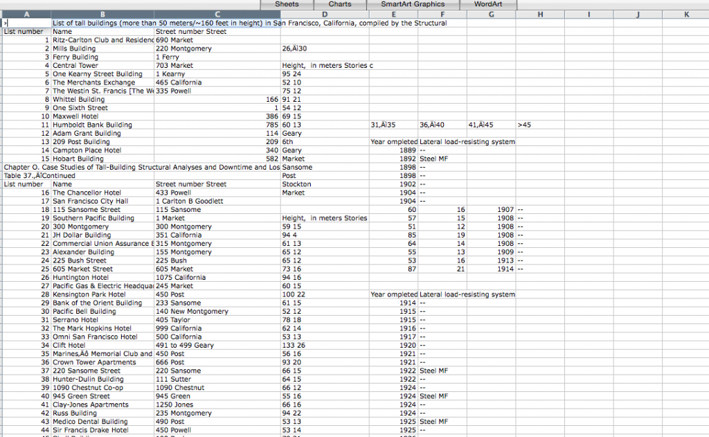 So I tried the quickest and dirtiest way I know: copy the table from the .PDF into Word, then from Word (where it’s recognized as a table) copy it into Excel.
There are a couple hundred buildings listed, but the ones cited in the story are steel moment frames. Erected before a 1994 building code outlawed a flawed welding technique, they harbor particular risk in a quake of magnitude seven or higher.
From there it was a question of sorting the buildings listed as “Steel MF,” noting that a couple are listed alternatively as “Steel moment frame” and one as simply as “MF.” Messy messy messy: also, totally typical. (There were also about 15 more listed as Steel MF in combination with some other reinforcement, since it would require more reporting to figure out if they’re as risky, these were left out.)
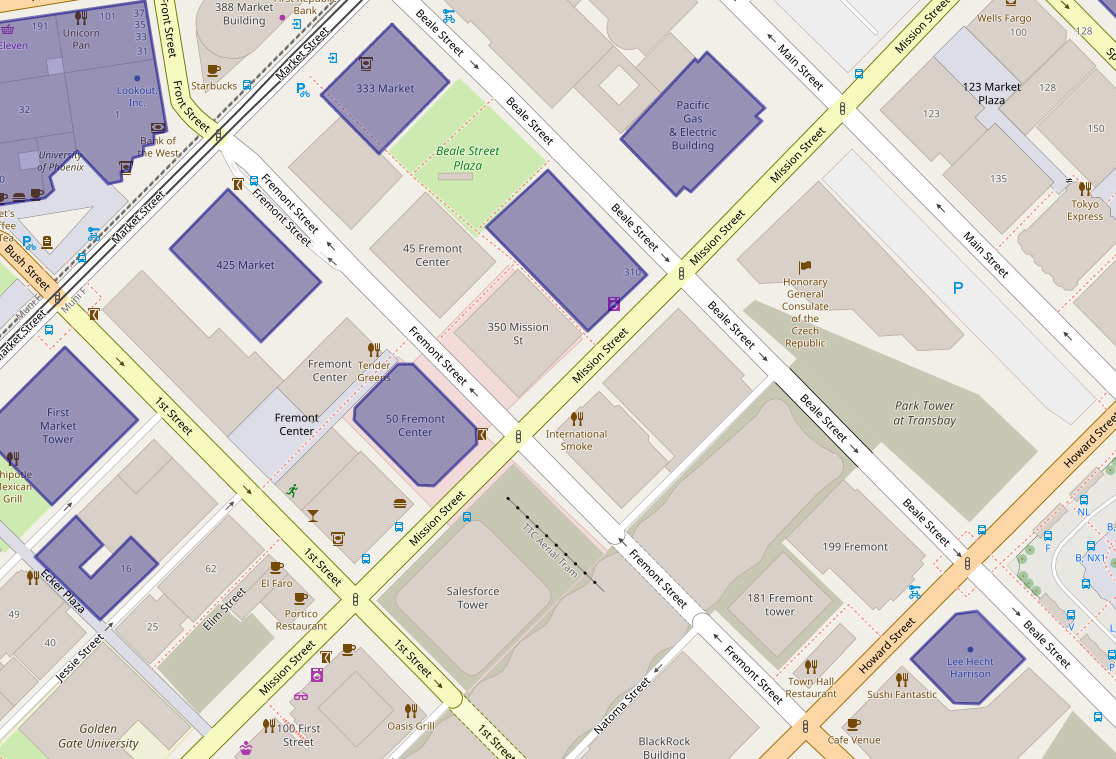
Then I checked the addresses against the story, added polygons for the nine new addresses to the previous uMap, downloaded it as a .KML file and started playing around in Google Maps.
The resulting map is a little disappointing. For starters, the polygons from uMap (which uses OpenStreetMap) don’t jibe that well with Google. As for the images – since the real a-ha if you live or work in San Francisco is how many of these buildings you’re in or around – I always forget how bad these are in the noob version of Google Maps. When you’re editing in the map, they are Polaroid-style pop-ups that resize whatever pic you throw in. 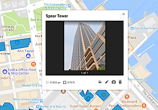 The published version looks nothing like that and the overall effect with these building shots (all vertical) is horrific. Ugh. There’s no way to resize the window from this version of Google Maps – the alternatives are Google Fusion tables (which wouldn’t solve the problem here since AFAIK it works with points, not polygons) or programming via the Google Maps API.
Why this happened
So how did the New York Times undercount the number of especially shaky high rises? Going on my experience with newsrooms (long) and with data (short but painful) my first guess is that the USGS mistakenly gave the Times an Excel or .CSV file that was different from what ended up in the final report.
The reporter knew there were enough buildings to warrant a story, somewhere around 40, the graphics person had the file, made the map and those numbers were plugged into the story and fact checked without going back to the published report.
Or there was some glitch between the formats – given how annoying the process of getting information from .PDF into anything – it’s easy enough. Data cleaning is the least interesting, most tedious part of any project. In this case, if I’m right, there are 20 percent more risky buildings than originally reported.
