Data points: visualization that means something [review]

Proving a point about data with the author's wedding photos.

Proving a point about data with the author’s wedding photos.

Nathan Yau is a self-appointed cicerone who shows the rest of us around the big, beautiful data visualization world.

A statistician by trade, the likeable, plain-speaking Yau runs Flowingdata.com. And, like all good tour guides, his job is to get you to think about what he’s presenting, not just drop your jaw at the sights.

In “Data Points: Visualization That Means Something,” [public library] Yau wants you to think about sample size — even if he has to show you with a jar of gumballs. To bring home the point about data representing real life, he takes out his own wedding photos. Later in the book, he manages to transform an eye-crossingly dull table of U.S. education stats into 29 different graphics to show how it’s done.
Continue reading

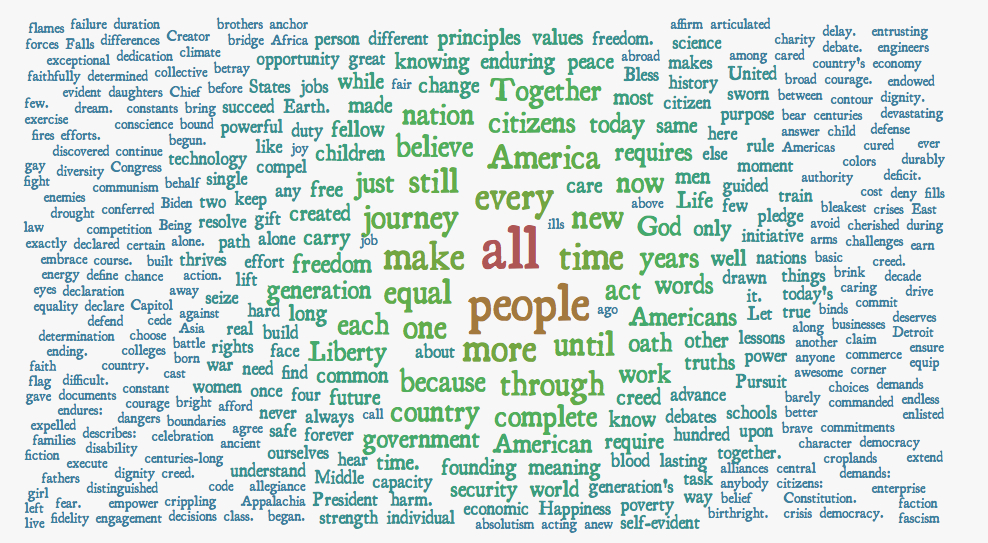
President Obama’s 2013 inauguration speech as a word cloud

Obama 2013 inauguration word cloud

Yeah, I know. Word clouds don’t tell the whole story, or even an accurate story. But I had a fun few minutes playing with Word it Out and President Obama’s inauguration speech.

The program lets you add up to 728 words and then cherry pick what words to include, weight them by count and choose how to order them. It automagically discards articles and punctuation, too, and lets you edit either list of included and excluded words.

I used about 350 and as incomplete as it is, you still get a flavor of the speech – from the words “gay” “fight” “diversity” at the far left edge to “principles” “values” “enduring peace” top center and “faction and “fascism” in the far right bottom corner.

You can check out the full transcript of his 2013 inauguration – which included mentions of Seneca Falls, Selma and Stonewall – here.

And for an amazing take on frequently used words in US presidential inauguration speeches, check out Santiago Ortiz’s stunning work.