Data points: visualization that means something [review]

Proving a point about data with the author's wedding photos.

Proving a point about data with the author’s wedding photos.

Nathan Yau is a self-appointed cicerone who shows the rest of us around the big, beautiful data visualization world.

A statistician by trade, the likeable, plain-speaking Yau runs Flowingdata.com. And, like all good tour guides, his job is to get you to think about what he’s presenting, not just drop your jaw at the sights.

In “Data Points: Visualization That Means Something,” [public library] Yau wants you to think about sample size — even if he has to show you with a jar of gumballs. To bring home the point about data representing real life, he takes out his own wedding photos. Later in the book, he manages to transform an eye-crossingly dull table of U.S. education stats into 29 different graphics to show how it’s done.
Continue reading

Where in the world can you still send a telegram? [Map]

Telegrams may have gone the way of the steam engine, but there are number of places around the world, from Japan to Mexico, still sending them.

The news about India shuttering its 162-year-old telegram service sounded like the last, labored puff of a country making progress into a bold new era.

So I wondered where people are still using them as a swift, inexpensive means to send condolences and well wishes on important occasions. (An outfit called – what else? – iTelegram took over from Western Union for the U.S., though I can’t remember ever sending or receiving a telegram here.)
Continue reading

Painful lessons in data journalism: scraping with Python

3932023011_32e5e18838_z

Lost in the woods. CC-licensed, Chris-Håvard Berge on Flickr.

Lost and found ads can be a good way to sniff out a story.

Take the ones on Craigslist about iPhones. There’s a woman who gained a husband in a quickie wedding at city hall but left her iPhone behind. Or a drunk college kid who dropped his phone on the passenger seat of a good samaritan who took him home.

Is there a bigger story about lost and stolen iPhones? To find out, I scraped all 50 states of Craigslist lost and found ads using Python and BeautifulSoup. If you want to check out or improve that code, it’s on GitHub. Here’s the full story, with charts and things!

The project required more fist clenching and eye straining than anticipated – even though writing a basic scraper for Craigslist is considered an easy-peasy programming project.

Let me just say it: as a novice Pythonista, I am challenged by nearly everything. I mean, command line interface, seriously? But I can get past that. I slogged through (and recommend) Learning Python the Hard Way, as well as finished some examples in Scraping for Journalists.
Continue reading

Five Things I Learned This week From Pope Magazine

This week's edition of "Il Mio Papa."

This week’s edition of “Il Mio Papa.”

For you non-Italian readers, here is this week’s news from the only weekly mass-market magazine about the Pope, “Il Mio Papa:”

  • The Pope Confesses: “I’m a sinner too”
  • The inside scoop on the cross he wears around his neck
  • Francis warns politicians: no heaven for the corrupt
  • The Angelus prayer and audience in the square
  • Meet the cousins of the Pope in Piedmont

And, for the cover story of “My Pope,” Francis and Obama: an historic meeting. (The line above it reads: “What they said and the gifts they exchanged.”)
Continue reading

How to lie with numbers: taxpayer spending on former US presidents

*Source, AP. Figures rounded.

*Source: AP. Figures rounded.

There’s a story making the rounds of most major media outlets on how much US taxpayers shell out every year to maintain the four living former presidents (FPOTUSes?).

Bill Clinton billed John and Jane Doe $450,000 for his office space, George W. Bush, who spent the most overall topping $1.3 million, racked up $85,000 in phone calls.  Even Jimmy Carter (wasn’t he on duty during “Argo” or something?) had interns affixing $15,000 in postage stamps in 2012.

But the published numbers don’t tell much of a story – or at least a very accurate one. Continue reading

Why journalists should bite the bullet and map with Quantum GIS

A view of Alameda census info over Stamen's terrain map.

A view of Alameda census info over Stamen’s terrain map in QGIS.

If you’re a novice mapper, tools like Google Fusion Tables (aka the WordPress of mapping) might make Quantum GIS look like rough terrain.

QGIS is an open source powerhouse for mapping that has a number of advantages. It’s free (as in free speech) runs on Mac or PC and you can import shapefiles, coverage data plus any personal geodatabases you may have on hand.

So get over yourself and try it, advised Len De Groot of Knight Digital Media Center in his recent online Intro to Data Mapping class.

“It’s not for the faint of heart. But there’s a lot of drag and drop, something most of us can do,” he said in the hour-long session to a group of around 60 global journalists. “You do have to build up some muscle memory on how this works, but it will make your data mapping much more robust.” Continue reading

Lessons from John Snow for the novice data journalist

A modern, color take on Snow's original.

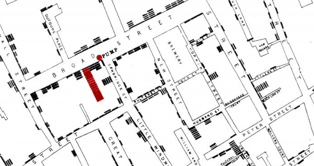
An interactive take on Snow’s original map with color by andreit on umapper.

Dr. John Snow put cholera on the map. Well, to be more precise, he mapped the cholera outbreak of the 1854 in London’s Soho, stacking up the deaths against a contaminated water pump and saving an untold number of lives.

Snow’s bicentennial birthday happens this month, on March 15. They’ll be raising a glass to him at the Soho pub bearing his name as well as holding a free symposium in his birthplace of York.

His map is the stuff of textbooks, from design guru Edward Tufte – who even made a pilgrimage to the water pump – and was set before us in the MOOC Infographics and Data Visualization course and KDMC’s two-day seminar on data as a paragon of good information design.

In both classes, the clean, simple map elicited a whoosh of “ahh!” from the students – you look and immediately get it. (The back story of Snow’s map makes it even more powerful – the good doc was laboring against local authorities who still believed the miasma theory.)

A detail of a 1940s malaria map of Italy. LSHTM Library & Archives

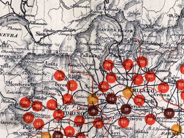
A detail of a 1940s malaria map of Italy. LSHTM Library & Archives.

His legacy lives on in health maps everywhere. The London School of Hygiene and Tropical Medicine (LSHTM) is hosting an art exhibit in Snow’s honor – you can check out some of the items, including the above gem of malaria outbreaks in fascist troops in Italy, here.

One of the big takeaways for me, as a novice, is how working with data is often a group effort. (Journalism, though it does require getting people to talk to you, is largely a solitary pursuit. Scribbling away in a garret or blogging with your laptop at a cafe doesn’t take a village.)

In his excellent The Ghost Map  (public library), Steven Johnson recounts how Snow was helped out by local curate Reverend Henry Whitehead, one of the few people who kept knocking on doors and talking to people during the outbreak. Whitehead’s knowledge of those particular dark, odorous London streets proved invaluable, even though he first believed Snow was wrong.

It can be tempting to hover over your spreadsheets and tinker with your scripts, much like you might worry over the structure of an article, but involving the community makes a difference.

Mayor busts out infographic to summarize San Francisco’s state of the city

Infographic of the state of San FranciscoSan Francisco Ed Lee busted out an infographic to summarize his three-hour “State of the City” address for the nerds assembled at the TechCrunch Crunchies. Lee always reminds me of that affable uncle about to tell you a pun at some ghastly family function, so I don’t think he did it entirely seriously – see the Super Bowl wins at the center. It’s an interesting idea, though, releasing a snapshot of a long presentation that most locals didn’t see in a digestible format.

President Obama’s 2013 inauguration speech as a word cloud

Obama 2013 inauguration word cloud

Yeah, I know. Word clouds don’t tell the whole story, or even an accurate story. But I had a fun few minutes playing with Word it Out and President Obama’s inauguration speech.

The program lets you add up to 728 words and then cherry pick what words to include, weight them by count and choose how to order them. It automagically discards articles and punctuation, too, and lets you edit either list of included and excluded words.

I used about 350 and as incomplete as it is, you still get a flavor of the speech – from the words “gay” “fight” “diversity” at the far left edge to “principles” “values” “enduring peace” top center and “faction and “fascism” in the far right bottom corner.

You can check out the full transcript of his 2013 inauguration – which included mentions of Seneca Falls, Selma and Stonewall – here.

And for an amazing take on frequently used words in US presidential inauguration speeches, check out Santiago Ortiz’s stunning work.

Mapping the term ‘fiscal cliff’ with the New York Times API

8262373294_99fd141ed2_bAs time goes by, it looks like we’re all going to fall off the fiscal cliff.

When thinking about ideas to test out the New York Times API, which lets you dig into everything from campaign finance to geographic tags in the old gray lady’s formidable database, I wanted to keep it simple. (The learning curve was already steep for me, to be honest.)

The chart is my first pass at using the NYT API, based in part on Jer Thorp’s chapter about it in “Beautiful Visualization,” which you can find at Amazon  or a public library.

The result is a simple cliff graphic that mimics the momentum the term gained along with the budget crisis. Wikipedia dates the term “fiscal cliff” to 2011, but Federal reserve chairman Ben Bernanke gave it heft in February 2012 with testimony before the House Committee on Financial Services, the first mention is here: nyti.ms/Tcd7Lq