Why OpenStreetMap matters: Where did Dokdo go?

One of the rocky outcrops under dispute. Photo // CC BY NC

Battle lines have always been drawn over maps. Place names are political, cultural, temporal: from Constantinople to Istanbul and Burma to Myanmar what a place is called matters.
In the digital age, however, you have no idea who is behind the changes and why.  The companies that make the maps millions of people use every day change names following opaque processes that appear to depend on who lobbies loudest at the moment. It’s a strong argument for free, public, editable maps like OpenStreetMap where both the changes and the debate are transparent.

About a week ago, I spotted this poster petitioning Google to put Dokdo back on the map at San Francisco’s Korean American Community Center of San Francisco & Bay Area.

Continue reading

Quick preview of forthcoming book “All Over the Map: A Cartographic Odyssey”

Most of us have swerved a few wrong turns or hacked through some questionable trails and cursed the map. Most of us, though, wouldn’t spend seven years and engage dozens of experts to make a better one.

Then again, most of us aren’t Bradford Washburn. This climb-every-mountain polymath was let down by the sketchy trail maps of the Grand Canyon available in 1969. At the time, age 60 and director of the Boston Science Museum, he knew what made a good map. Washburn was the first climber to scale 20,320-foot Denali and his map of the peak is still considered the definitive map of the region. A pioneer in aerial photography, he’d go on to map Mount Everest and the Presidential Range.

But it’s his National Geographic Grand Canyon map, finally published in 1978, that illustrates his “extreme dedication to the craft of map making” says Betsy Mason, co-author of Nat Geo’s All over the Map blog. Mason previewed one of the 80 stories and showed off some of the 200 maps from forthcoming book she wrote with colleague Greg Miller titled “All Over the Map: A Cartographic Odyssey” at the recent California Map Society spring meeting.

It was the best of crowds (people who readily chime in with the correct pronunciation of “theodolite” and already grasp the merits of hachuring) and the worst of crowds (after lunch on a warm Saturday) but the story behind the Grand Canyon map kept people mostly awake and ready to push over the 45-minute session limit with questions.

Mason and Miller first started the Map Lab blog back at Wired, then moved it over to National Geographic in 2013. Mason, taken with Washburn’s Grand Canyon map the first time she saw it, went archive diving at her new employer’s and found a “huge trove of boxes” about the making of the map.

Photo brewbooks on Flickr. // CC BY NC

Continue reading

Mapping UNESCO’s Intangible Cultural Heritage spots

Looking at the most recent UNESCO Representative List of the Intangible Cultural Heritage of Humanity it’s clear that these “elements,” as they’re called, are all over the map.

There’s painting, weaving, pizza making and spring rituals: but while they offer up videos, photos and text — there’s no actual map of these landmarks in sight.

Making that map shines a spotlight on why organizing data is crucial — and how every organization is a data trove and should be its own best data detective. Plotting visually can inform decision making and highlight patterns – inside trends to be worked into deeper groves or used to recalucate course. The list, according to UNESCO, is “made up of those intangible heritage elements that help demonstrate the diversity of this heritage and raise awareness about its importance.” Continue reading

Five-minute map: San Francisco’s proposed Uber/Lyft loading zones

Update: March 23, 2018. A pilot zone geofencing Lyft drivers from picking up passengers on Valencia Street has been added in the Mission. Source: Examiner.com

If you drive, walk or bike in San Francisco you know what a nightmare the ride-hailing services can be.

And if you use them often you’re probably in the habit of trying to pin yourself on a side street or a big empty parking space/driveway and pray they don’t double park while trying to find you. (Zipping past the anecdotal, it’s been calculated that 45,000 Uber and Lyft vehicles now operating in San Francisco account for more than 200,000 trips a day.)

So now the city is interested in adding ride-hailing passenger pick-up zones in a horse- trading effort to wring more data from these startups.

The San Francisco Examiner reports there are seven proposed “loading zones” and maybe one or two will be piloted. It’s a well-reported story — except that it’s missing a map. The neighborhoods are Hayes Valley, Inner Richmond, Inner Sunset, Noe Valley, North Beach, Marina and downtown.

Five minutes later with Google Maps:

A few things jump out — there’s nothing in the traffic-choked Mission district (see update above) and two “maybes” downtown. (The mapped one on Howard Street above and another potential one left unmapped since it’s described as “between Howard and Third or Fourth streets.”)

Also, once they’re mapped, if you zoom in it’s apparent that the length of these zones varies widely. The North Beach one looks like road rage waiting to happen.

San Francisco does have passenger loading zones already — white curbs with a time limit of five minutes — which in my armchair estimation (and the name “curbs”) says they’re mostly shorter than the approximately 600 feet (two blocks) of the shortest ride-hailing zones in the Richmond and Sunset…

Thoughts?

Full story over at The Examiner.

What’s under the canals of Venice? Old boats, tires and a few surprises

Image courtesy Ismar-Cnr.

Most visitors to Venice drift through the canals on gondolas taking selfies. But a group of researchers spent seven months puttering along pointing high-resolution multibeam echosounders into the waters instead. About 30 of them in all worked aboard the powerboat Litus, intent on mapping the Venice lagoon to gauge the effects of climate change on one of the world’s most improbable cities.

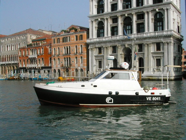
Research boat Litus, courtesy Ismar-CNR

While what’s under those gray-green waters isn’t exactly surprising — boat parts, old tires and containers — scientists say the underwater elevation mapping (that’s “bathymetry,” for the technically minded) comes at a critical time.

Old boats, tires and containers. Image courtesy Ismar-Cnr.

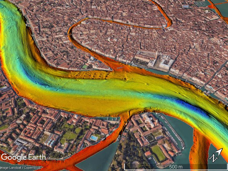
The last 100 years have radically altered the shape and ecological makeup of the lagoon, researchers say: for starters, salt marsh areas shrunk by half and underlying sediment has radically shifted. The “floating city” already struggles to stay above water in the spring and summer floods and relative sea level rise is expected to increase their frequency. The Mose system, with its 78 mobile gates that can hold back almost 10 feet of water, construction launched in 2003 and is said to be near completion in 2018.

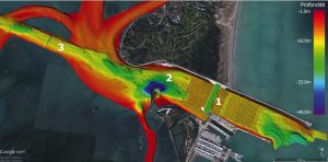
Entrance to Malamocco port 1) Mose gate 2) 48-meter (157-foot) trench 3) the oil refinery canal. Image courtesy Ismar-Cnr.

“Before the Mose system begins to function, it was important to have a full picture of the bathymetry and currents of the tidal channels and inlets, which are the most dynamic portion of the lagoon,” researchers say in a paper published in “Nature.” They caution that the relatively rapid erosive process could threaten the stability of the “hard structures” (read: priceless palazzos) in the near future and should certainly be periodically monitored.

If you want to dig into the datasets, the scientists from research groups (Ismar-Cnr and Iim) have CC-licensed and made them available online with the paper.

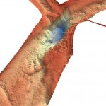
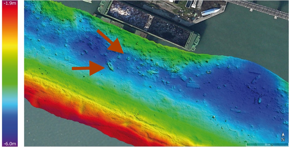
A scour hole found where two channels meet. Image courtesy Ismar-Cnr.

“The data also allows us to identify areas with large dunes at the bottom and adjacent erosion sites that document the most dynamic points in the deep lagoon, where it’s important to cyclically repeat these studies to quantify the movement of sediments,” head of the study Fantina Madricardo says in the press release (translation mine.)

Part of the reason these Venice maps look so trippy (or alarming?) is due to the city’s curious geography, perching atop 118 islands bridged by canals. On most bathymetric maps, deeper waters are represented by soothing darker shades (green, blue, violet) and warmer colors (red, orange, yellow) represent shallower waters. A bathymetric map of the San Francisco Bay by comparison looks, well, a lot more soothing despite its notorious currents.

How to investigate your government through algorithms

Some kinds of reporting-by-the-numbers are anything but lazy. Take investigations looking into algorithms — examining the formulas used by the government to determine who is more likely to commit a crime or how likely your building is to have a fire inspection.

Speaking at the recent International Festival of Journalism, Nick Diakopoulos, assistant professor at the University of Maryland’s Philip Merrill College of Journalism and a member of its Human Computer Interaction Lab, gave a solid primer on how to get started.

He’s been studying the wider reach of algorithms in society, government and industry for about four years, coming at it from a computer science background as a “techie who worked my way into journalism.” Boyish, bespectacled and occasionally prone to professorial turns of phrase like “algorithmic accountability,” Diakopoulos offered a look into the numbers that shape our lives. Continue reading

Digital mapping finally blossoms for parks and rec

CC-licensed, thanks to KM on Flickr.

CC-licensed, thanks to KM on Flickr

If you went by the maps available today your smartphone, you’d probably think the era of paper maps went out with the Rubik’s Cube.

But the next time you’re in a garden or park, you might come across a group of volunteers huddled around an 11×17 black-and-white printout, hopelessly trying to verify what should be where, clumsily marking it up with pencils and colored highlighters. Their work trails back indoors where it adds to a pile of similar maps that have to be verified (or interpreted?) before changes are put into the data base by a staffer. They are often printed out again and verified for accuracy.

The hateful verification map, SFBG.

A typical paper verification map, SFBG.

That’s why around 40 people from zoos, gardens and parks from around the world came to a recent talk to hear how Steve Gensler, GIS manager of the San Francisco Botanical Gardens, and Veronica Nixon of the Desert Botanical Garden in Phoenix are using Collector for ArcGIS to maintaining botanical garden plant records at the ESRI User Conference.

Continue reading

The Associated Press Stylebook weighs in on data journalism

bye3nzmg6q355a3splxzCC-licensed, via hatalamas on Flickr.

If you write about tech, you’ll find the Associated Press Stylebook is a little bit like Dear Abby. By the time the bouffant-hair-and-matching-handbag set gets around to addressing an issue, it’s often already been answered by collective common sense.

Still, it’s nice to see the venerable news organization writing about data journalism in the same update where it finally relinquishes capitalizing the word internet.

The AP Stylebook entry on data journalism, added 2016-04-19, weighs in at just under 500 words.

It begins with six rules for evaluating a data set that range from the very basic (“What is the source?”) to the kind of deep dive that may prevent you from ever filing the story (“Is there a data dictionary or record layout document for the data set – which would describe the fields, types of data they contain and details and announcing detail as indicated?”) Side note: If you’re looking for an entire book of how to present data facts and figures for journalists, my favorite is still “The Wall Street journal guide to information graphics: the dos and don’ts of presenting data, facts, and figures” by Dona M Wong. [public library]

Screen Shot 2016-06-02 at 1.47.30 PMThe next section launches into the math of doing data journalism, a reminder that word people are often not numbers people. Or a reminder to all that, yeah, elementary school math is good to know.

“Avoid percentage and percent change comparisons from a small base. Rankings should include raw numbers to provide a sense of relative importance.
When comparing dollar amounts across time, be sure to adjust for inflation. When using averages (that is, adding together a group of numbers and dividing the sum by the quantity of numbers in the group), be wary of extreme, outlier values that may unfairly skew the result. It may be better to use the median (the middle number among all the numbers being considered) if there is a large difference between the average (mean) and the median.”

It heads into more advanced territory with a paragraph on causality, rounding numbers and sample size before winding up with a solid reminder for data-happy hacks: “Try not to include too many numbers in a single sentence or paragraph.”

Now we only have to wait and see how the Stylebook passes judgement on the proper abbreviation for “internet of things.”

Armchair mappers: Help prepare for the next humanitarian crisis

Screen Shot 2015-05-07 at 5.05.35 PMKathmandu before and after the Humanitarian OpenStreetMap Team dived in.

Just 48 hours after Nepal’s devastating earthquake, thousands of volunteers from around the world helped create maps that guided emergency response teams.

Many of these “digital humanitarians” came from OpenStreetMap, an open source mapping effort. The Humanitarian OpenStreetMap Team (HOT) in launched 2010 after the earthquake in Haiti, when the office safeguarding country’s maps pancaked in the 7.0 temblor.

_Schuyler Erle shows what happened to Haiti's mapping office post earthquake._

Schuyler Erle shows what happened to Haiti’s mapping office after the earthquake.

Continue reading