How to lie with numbers: taxpayer spending on former US presidents

*Source, AP. Figures rounded.

*Source: AP. Figures rounded.

There’s a story making the rounds of most major media outlets on how much US taxpayers shell out every year to maintain the four living former presidents (FPOTUSes?).

Bill Clinton billed John and Jane Doe $450,000 for his office space, George W. Bush, who spent the most overall topping $1.3 million, racked up $85,000 in phone calls.  Even Jimmy Carter (wasn’t he on duty during “Argo” or something?) had interns affixing $15,000 in postage stamps in 2012.

But the published numbers don’t tell much of a story – or at least a very accurate one. Continue reading

Why journalists should bite the bullet and map with Quantum GIS

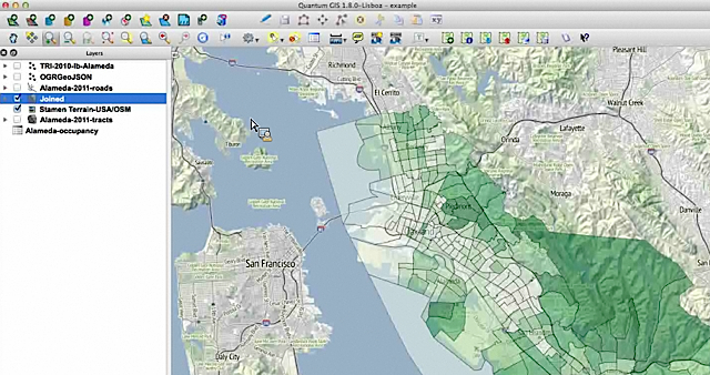
A view of Alameda census info over Stamen's terrain map.

A view of Alameda census info over Stamen’s terrain map in QGIS.

If you’re a novice mapper, tools like Google Fusion Tables (aka the WordPress of mapping) might make Quantum GIS look like rough terrain.

QGIS is an open source powerhouse for mapping that has a number of advantages. It’s free (as in free speech) runs on Mac or PC and you can import shapefiles, coverage data plus any personal geodatabases you may have on hand.

So get over yourself and try it, advised Len De Groot of Knight Digital Media Center in his recent online Intro to Data Mapping class.

“It’s not for the faint of heart. But there’s a lot of drag and drop, something most of us can do,” he said in the hour-long session to a group of around 60 global journalists. “You do have to build up some muscle memory on how this works, but it will make your data mapping much more robust.” Continue reading

Lessons from John Snow for the novice data journalist

A modern, color take on Snow's original.

An interactive take on Snow’s original map with color by andreit on umapper.

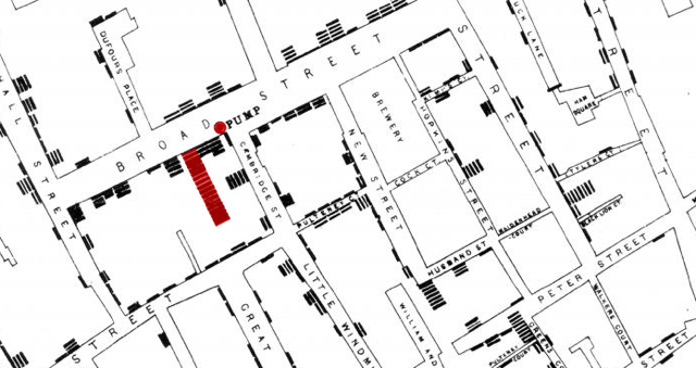
Dr. John Snow put cholera on the map. Well, to be more precise, he mapped the cholera outbreak of the 1854 in London’s Soho, stacking up the deaths against a contaminated water pump and saving an untold number of lives.

Snow’s bicentennial birthday happens this month, on March 15. They’ll be raising a glass to him at the Soho pub bearing his name as well as holding a free symposium in his birthplace of York.

His map is the stuff of textbooks, from design guru Edward Tufte – who even made a pilgrimage to the water pump – and was set before us in the MOOC Infographics and Data Visualization course and KDMC’s two-day seminar on data as a paragon of good information design.

In both classes, the clean, simple map elicited a whoosh of “ahh!” from the students – you look and immediately get it. (The back story of Snow’s map makes it even more powerful – the good doc was laboring against local authorities who still believed the miasma theory.)
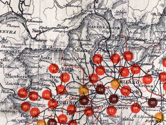
A detail of a 1940s malaria map of Italy. LSHTM Library & Archives

A detail of a 1940s malaria map of Italy. LSHTM Library & Archives.

His legacy lives on in health maps everywhere. The London School of Hygiene and Tropical Medicine (LSHTM) is hosting an art exhibit in Snow’s honor – you can check out some of the items, including the above gem of malaria outbreaks in fascist troops in Italy, here.

One of the big takeaways for me, as a novice, is how working with data is often a group effort. (Journalism, though it does require getting people to talk to you, is largely a solitary pursuit. Scribbling away in a garret or blogging with your laptop at a cafe doesn’t take a village.)

In his excellent The Ghost Map  (public library), Steven Johnson recounts how Snow was helped out by local curate Reverend Henry Whitehead, one of the few people who kept knocking on doors and talking to people during the outbreak. Whitehead’s knowledge of those particular dark, odorous London streets proved invaluable, even though he first believed Snow was wrong.

It can be tempting to hover over your spreadsheets and tinker with your scripts, much like you might worry over the structure of an article, but involving the community makes a difference.

Mayor busts out infographic to summarize San Francisco’s state of the city

Infographic of the state of San FranciscoSan Francisco Ed Lee busted out an infographic to summarize his three-hour “State of the City” address for the nerds assembled at the TechCrunch Crunchies. Lee always reminds me of that affable uncle about to tell you a pun at some ghastly family function, so I don’t think he did it entirely seriously – see the Super Bowl wins at the center. It’s an interesting idea, though, releasing a snapshot of a long presentation that most locals didn’t see in a digestible format.

President Obama’s 2013 inauguration speech as a word cloud

Obama 2013 inauguration word cloud

Yeah, I know. Word clouds don’t tell the whole story, or even an accurate story. But I had a fun few minutes playing with Word it Out and President Obama’s inauguration speech.

The program lets you add up to 728 words and then cherry pick what words to include, weight them by count and choose how to order them. It automagically discards articles and punctuation, too, and lets you edit either list of included and excluded words.

I used about 350 and as incomplete as it is, you still get a flavor of the speech – from the words “gay” “fight” “diversity” at the far left edge to “principles” “values” “enduring peace” top center and “faction and “fascism” in the far right bottom corner.

You can check out the full transcript of his 2013 inauguration – which included mentions of Seneca Falls, Selma and Stonewall – here.

And for an amazing take on frequently used words in US presidential inauguration speeches, check out Santiago Ortiz’s stunning work.

Mapping the term ‘fiscal cliff’ with the New York Times API

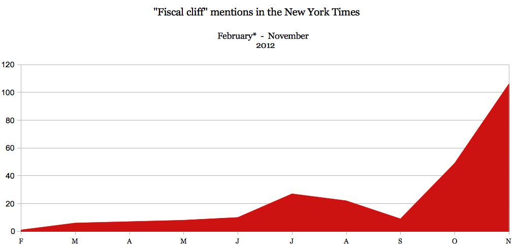
8262373294_99fd141ed2_bAs time goes by, it looks like we’re all going to fall off the fiscal cliff.

When thinking about ideas to test out the New York Times API, which lets you dig into everything from campaign finance to geographic tags in the old gray lady’s formidable database, I wanted to keep it simple. (The learning curve was already steep for me, to be honest.)

The chart is my first pass at using the NYT API, based in part on Jer Thorp’s chapter about it in “Beautiful Visualization,” which you can find at Amazon  or a public library.

The result is a simple cliff graphic that mimics the momentum the term gained along with the budget crisis. Wikipedia dates the term “fiscal cliff” to 2011, but Federal reserve chairman Ben Bernanke gave it heft in February 2012 with testimony before the House Committee on Financial Services, the first mention is here: nyti.ms/Tcd7Lq


Pompeian red? It’s actually ochre, researchers say

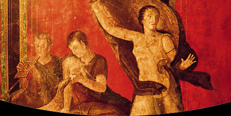
Pompeii: all about ochre?

Those rich reds adorning paintings in Pompeii were originally ochre —  Italian researchers say they now think that sensuous Pompeian red is the result of an accident.

Researchers at the national science council (CNR) say the original signature color at the ill-fated city of Pompeii was probably yellow –  ochre to be specific.

Before Mount Vesuvius blew its top in 79 A.D. and buried the city, it emitted high-temperature gas which turned the original yellow color that dark red. It’s not an entirely new discovery – ochre was also the main color at Herculaneum, sister city also buried by Vesuvius.

“Thanks to the investigations we have ascertained that the symbolic color of the archaeological sites in Campania is the result of the action of high temperature gas leakage which preceded the eruption of Vesuvius in 79 A.D.,” says Sergio Omarini of CNR.
“Experts already knew about the color alteration, but this research makes it finally possible to quantify to the extent of it.”

Researchers went back to texts by Pliny and Vitruvius to see how their contemporaries made red – cinnabar, mercury compound, red lead, lead compound and the rarest and most expensive pigments, mainly used in the paintings.

To check out the composition in the paintings, scientists used a non-invasive X-ray fluorescence (XRF) spectrometer that reveals the presence of chemical elements that exclude red lead and cinnabar – leading them to believe ochre was the original color.

Somehow Pompeian ochre just doesn’t lend the same tone.

Got a buck? Help out real-life Da Vinci Code quest for lost Leonardo

This is just about as cheap a thrill as they get: by pledging even just a dollar, you can help fund a project to find a lost Leonardo Da Vinci fresco in Florence, Italy.

Photographer Dave Yoder has been working on for a number of years  on a quest funded by the National Geographic Society to uncover The Battle of Anghiari in Palazzo Vecchio.

Because of the complications of doing just about anything in Italy – this involves going between ancient palazzo walls after all — it requires expensive expertise.

He’s put up a Kickstarter page to fund the sci-fi movie-worthy gamma camera needed to locate the painting which probably lies between the walls. (It seems Vasari couldn’t bring himself to cover Leonardo’s masterpiece when commissioned to paint over it in 1563).

Dave is a friend and it’s a fascinating project – one I also enjoyed reporting on — so I hope you’ll consider kicking in what you might spend on a cappuccino. Higher pledges $35 and up will earn you a digital e-book or prints of the project.

You can check out his pics on the project so far here.

To donate or for more information, see Kickstarter

Check out Soundtracker, like Pandora for Italian music


As someone who has a hard time remembering what it was like to listen to music before you could hit “shuffle” or curate a digital playlist, I’m a big fan of automated music recommendation and Internet radio service Pandora.

But that streaming service offers almost no Italian music, whether you want classic folk, pop power ballads or moody dubs in dialect.

Enter Soundtracker,  launched in 2010 by two Italian entrepreneurs. Best part: it offers a lot more than just Italian music and the interface is in English.

Register for the site (it’s free) and start listening to artists you know before stone-stepping to those you don’t.

Start with Pino Daniele and you’ll soon be listening to Quintorigo, Almamegretta, 99 Posse and Bandabardo’.

Not sure how the algorithm works, but  it seems a little more freewheeling than Pandora — starting with 70s melodic rocker with a social conscience Fabrizio De’ Andre station got me to an aggro hip-hop number from Caparezza in under four tracks.

You can also download it as an app for your iPhone, Windows Phone 7 and, if you’re so inclined, share your location and tracks with your friends.

Buon ascolto!

Can a toe provide the answer to Mona Lisa mystery?

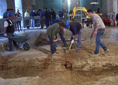
Excavations at Sant'Orsola.

Experts digging around a former convent in Florence have unearthed a big toe that might belong to Lisa Gherardini, the subject of Leonardo Da Vinci’s famed Mona Lisa painting.

Little is known about the real life of the noblewoman said to have posed for Da Vinci, but she is thought to have died in the 1540s in Florence’s Sant’Orsola convent.

Last month, experts started digging around Sant’Orsola in hopes of finding the remains of Gherardini.

Working on the project are two of Italy’s famed art super sleuths, Francesco Mallegni, the anthropologist/detective who famously brought to light Dante’s Cannibal Count and Silvano Vinceti.

So far, in the first tomb excavated under an altar, the only significant remains are a bone fragment, probably of the big toe of a left foot. Mallegni told daily La Nazione that it might belong to a woman and provide enough DNA material to identify Gherardini.

Research will continue with ground-penetrating radar in the central part of the church where they believe there may be other crypts.

The large Sant’Orsola complex dates to 1309, ceased its life as a convent in the 1800s, then became a tobacco factory before being used by the university up to the 1950s. It stood semi-derelict with its windows bricked-up until restoration work started in 2010.